GOV.UK Frontend release v2.0.0
2.0.0 (Breaking release)
⚠️ Changes in this release could break your project, please check the changelog notes to see if you need to update anything in your application.⚠️
Highlights for the 2.0.0 release include improvements to accessibility in all components with:
-
End-users can now specify the font-size in their browser GOV.UK Frontend will scale proportionally (PR #981)
-
Links and focusable elements no longer have poor contrast when focusing them. (PR #982)
Both of these changes we hope will help users with vision impairments use services.
We have also turned off compatibility mode by default in this release, if you use GOV.UK Template, GOV.UK Elements or GOV.UK Frontend Toolkit with GOV.UK Frontend you should re-enable this, see the notes for more information.
For the full list of breaking changes see the changelog notes below.
Thanks to @malcolmhire, @malydok and @fofr for helping us ship this release.
Things to look out for
“Why do my buttons have blue text?”
We have additional styles in GOV.UK Frontend that defend against overly specific CSS selectors in deprecated projects such as GOV.UK Elements, these are now opt-in by enabling compatibility mode - see the notes for more information.
“Why are all my components tiny or really big?”
Since components now use relative units for sizing their text they can appear the wrong size if the root html element has set the font-size to something unconventional, this is the case with GOV.UK Template, see the notes for more information.
Changelog
💥 Breaking changes
Set panel component's title heading level to 1 as default
We think the panel title should be the h1 in the majority of cases, so we made
it the default.
If you have need to change the Panel component heading to something other than
h1, you can do so by specifying headingLevel: <number> in the Nunjucks
macro.
(PR #967)
Remove deprecated govuk-visually-hidden-focussable class name
In 1.1 release we added a new, correctly spelt
govuk-visually-hidden-focusable CSS class and marked the old one as
deprecated.
To migrate you need to change govuk-visually-hidden-focussable to
govuk-visually-hidden-focusable in your codebase.
(PR #968)
Remove name-based width logic from date-input component
In 1.1 release
we removed styling which made the year field 4 characters wide, but was
coupled to the field's name.
However, to avoid making this a breaking release, we added logic to
automatically add the width classes based on the name.
We are now removing this behaviour. Instead, users need pass explicit classes
for each field in the items object for the desired width of the input field.
If you are not passing items at all, you will get the default items which include these classes.
If you are using the Nunjucks macro, you need to provide a width class for
each item, for example:
{{ govukDateInput({
"id": "dob",
"name": "dob",
"fieldset": {
    "legend": {
    "text": "What is your date of birth?"
    }
},
"items": [
    {
    "name": "day",
    "classes": "govuk-input--width-2"
    },
    {
    "name": "month",
    "classes": "govuk-input--width-2"
    },
    {
    "name": "year",
    "classes": "govuk-input--width-4"
    }
]
}) }}
If you are using plain HTML, you need to manually add a width-based class, such
as govuk-input--width-2 or govuk-input--width-4 to the input fields.
(PR #969)
Rename name argument of date-input component to namePrefix.
This is better reflective of the purpose of the argument, which is to prefix the name attribute of items. This is consistent with other components which use the name idPrefix to explain similar functionality.
If your project currently uses this optional argument with the date-input macro, you need to rename all instances of it to namePrefix (NB: this argument shouldn't be confused with the items.{}.name attribute which hasn't changed.)
(PR #984)
Turn off compatibility mode by default for GOV.UK Elements, GOV.UK Template, GOV.UK Frontend Toolkit
You do not need to make any changes if you do not use these projects alongside GOV.UK Frontend.
To migrate include the SCSS variables that correspond with the projects you depend on before importing GOV.UK Frontend styles into your app:
// application.scss
$govuk-compatibility-govukfrontendtoolkit: true;
$govuk-compatibility-govuktemplate: true;
$govuk-compatibility-govukelements: true;
@import "govuk-frontend/all";(PR #981)
Turn on relative typography (rem) by default
This allows for end-users to adjust GOV.UK Frontend components by setting their font size in their browser.
If you are using GOV.UK Frontend on with no other frameworks this should not break your project.
If you need to change this setting for compatibility with GOV.UK Elements, GOV.UK Template, GOV.UK Frontend Toolkit consider enabling compatibility mode.
Otherwise, set $govuk-typography-use-rem to false before importing GOV.UK Frontend styles into your app:
// application.scss
$govuk-typography-use-rem: false;
@import "govuk-frontend/all";(PR #981)
Remove anchor styling in govuk-lists
This was an undocumented feature of lists.
To migrate we recommend using adding .govuk-link class to any anchors within a govuk-list.
If you would like to replicate this functionality without adding a class you can also enable global styles (Note: global styles are enabled by default in the GOV.UK Prototype Kit)
(PR #985)
Remove the width declaration from the <select> component
The <select> component’s width will now be defined by it’s content. This addresses some accessibility issues with the select being 100% wide by default. If you want to style your select to be 100% wide we have added a new override class .govuk-!-width-full to allow this.
(PR #960)
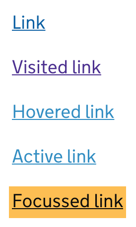
Use text colour on focus for better contrast
Updates the focus styles of links in GOV.UK Frontend so they pass WCAG contrast requirements.
(PR #982)
🆕 New features
Add a new width override class .govuk-!-width-full
You can now override elements that have an undefined or smaller percentage width to be 100% width of their container.
(PR #960)
Allow attributes on select items
You can now provide attributes on select items
attributes: { 'data-attribute': 'value' }
(PR #977)
🔧 Fixes
Textareas can now only be resized vertically, to prevent them being resized
outside of their container bounds. Additionally, they now have a minimum
height to prevent them being resized smaller than a text input.
(PR #976)
Defend tables against GOV.UK Elements code
(PR #983)