Add multirow section #2168
Add multirow section #2168
Conversation
02f803e to
0bc0030
Compare
|
Hey @kmeleta, nice work! Thank you. Image height :
If container color and color schemes are identical :
I am gonna test it out with dynamic content / meta object tomorrow. Also checking the final settings name and section icon. |


| @@ -327,3 +327,17 @@ | |||
| margin-left: 0; | |||
| } | |||
| } | |||
|
|
|||
There was a problem hiding this comment.
looks like Medium height doesn’t work, as I obtain a super short height.
There's a note about this in the PR description. Medium won't work until #2148 merges because it's a new addition to the image with text code.
Can we align content on the grid? If that complicated no need to do it.
If we want to introduce the additional magic for it, then technically yes. I just wasn't sure if we were aligned to do that or not. I can add it, but we should probably align as a group on that.
There was a problem hiding this comment.
@YoannJailin padding magic has been added. Intended logic is as follows
Removes..
- left padding on image-second rows
- right padding on image-first rows
- both left/right padding on mobile
If..
- both color scheme settings match, and..
- content container has no visible border, and..
- content container has no visible shadow
I somewhat feel like we might also want to make an exception for text center alignment though. What do you think? Maybe this is ok if the visual result always better, but this is a combination of conditions no one would be able to predict.
There was a problem hiding this comment.
Hey, logic with the 2 colour schemes being identical makes sense to me.
I somewhat feel like we might also want to make an exception for text center alignment though. What do you think? Maybe this is ok if the visual result always better, but this is a combination of conditions no one would be able to predict.
@kmeleta just to be sure, you mean the magic would not work if text is aligned center is that right?
There was a problem hiding this comment.
Yeah basically. This is what I'm seeing with the padding removed but text centered. It just looks a little odd to me
There was a problem hiding this comment.
@kmeleta I agree! Let's remove the magic on desktop when content is centered then :)
There was a problem hiding this comment.
@YoannJailin the center alignment magic has been added. I'll be sure to capture these decisions in the PR description as well.
| "type": "select", | ||
| "id": "desktop_content_position", |
There was a problem hiding this comment.
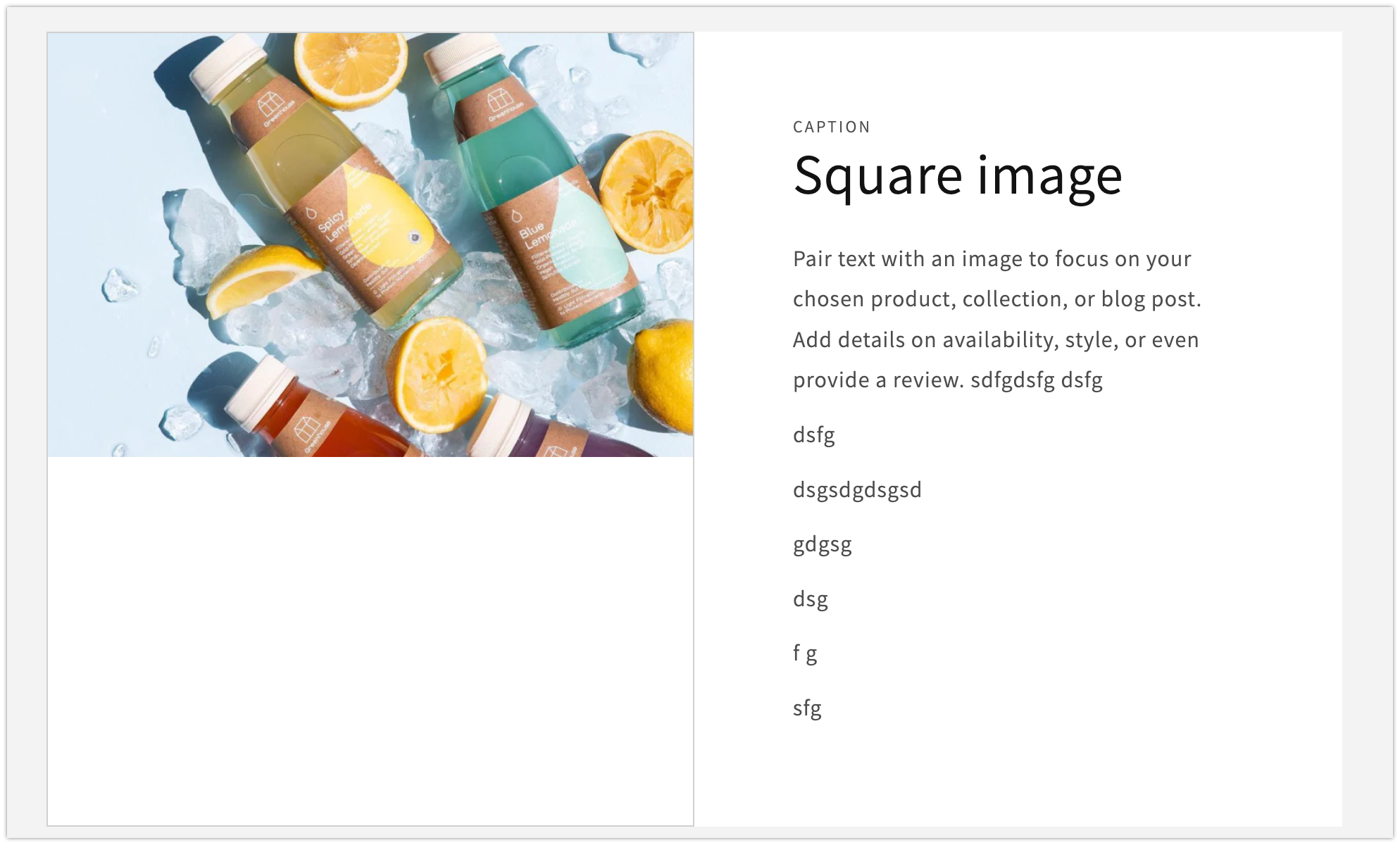
I think we might need to add a similar setting for the image 🤔 Right now it stretches based on the length of the content. And it seem weird that it'd do that since we have a specific image height setting for it but it doesn't end up respecting it, in this scenario:
Screenshot

There was a problem hiding this comment.
Hmm, well it's always been more of a minimum image height effect in image with text, so functionally this is expected. The reason for this I imagine is because if you have more of the "container" look configured, restricting the image height would look a little weird.
I doubt we'd want to add another setting into the mix right now regardless, but the question of preventing the height from growing in certain cases is worth at least asking. IMO this probably isn't necessary to account for, but this would be more of @YoannJailin's call.
There was a problem hiding this comment.
Yeah that could be something we do a follow up on if we see an actual need for it and if merchants do use longer texts.
There was a problem hiding this comment.
I'd like to use a follow up PR for this one so we can manage both Image with text and Multirow logic at the same time. Thoughts?
There was a problem hiding this comment.
I agree, let's not change the behavior we reused from Image with text. We can correct it on both sections later on.
5e8e62e to
fd3f095
Compare

|
Adding non-blocking feedback here
|
| }, | ||
| { | ||
| "type": "inline_richtext", | ||
| "id": "heading", |
There was a problem hiding this comment.
Thanks for taking a look @Rusty-UX
For storefronts integrations team: When testing I noticed that if I used title it didn't map to heading but to the first field is it possible to make that smarter?
Is it looking for the label or the id or what? Would be great if it was smarter, but would things sync up any better if I changed this setting id for the heading to title instead of heading or no?
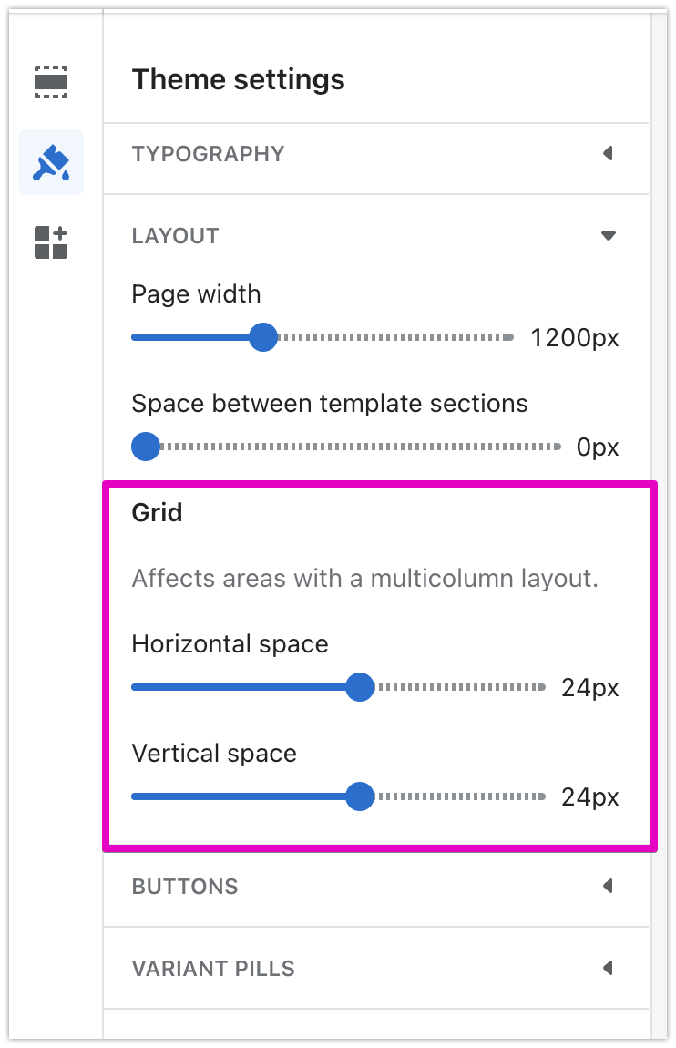
I didn't see any options to allow for greater spacing between the rows - not blocking but is that something we'd consider adding?
We decided to tie that into our global grid settings.
I'm questioning the specific language of the helper text that mentions multicolumn, but it will end up mentioning multirow there in some way.
There was a problem hiding this comment.
We are looking into the content for that helper text to clarify that. I've been thinking about replacing it with something close to: Affects areas with multiple columns or rows. but still need validation from Katy. 🙏
There was a problem hiding this comment.
Sorry for the delay.
@kmeleta I don't think we should change anything on naming based on our mapping algorithm. I think it's fine. If heading is the best UX for merchants in editor we should use that.
Background context on how mapping works if interested:
- We check the types first - and only compatible types can be mapped - e.g. file->image field → image setting (In the case of text we have a few potential compatible settings)
- Then we check the name of the field and the name of the setting, and check their similarity in name, and score that - based on the closeness of the names we match them.
0e787d4 to
c249130
Compare
|
Updated settings with Katy-approved copy (13cc4f2) @melissaperreault @ludoboludo if one or both of you could verify those I'll request translations. |
c249130 to
5e20ba4
Compare
5e20ba4 to
13cc4f2
Compare
|
Hello @kmeleta ! Just noticed something. Let's say the container color scheme and color scheme have the same color : It means that the container disappears, and we have that magic that puts the text content on grid (removing the gabs on each side). If we go on mobile, it's the same logic. But i noticed that if the Desktop content alignment is set to center, it impacts the mobile version (the gaps on each side of the text reappears) is there something we can do about that? |
|
We have received a translation request but there is a question blocking translation work. Your help is needed. Please answer the following questions.
|
assets/component-image-with-text.css
Outdated
| @media screen and (max-width: 749px) { | ||
| .collapse-padding .image-with-text__grid .image-with-text__content { | ||
| padding-left: 0; | ||
| padding-right: 0; | ||
| } | ||
| } | ||
|
|
||
| @media screen and (min-width: 750px) { | ||
| .collapse-padding .image-with-text__grid:not(.image-with-text__grid--reverse) .image-with-text__content { | ||
| padding-right: 0; | ||
| } | ||
|
|
||
| .collapse-padding .image-with-text__grid--reverse .image-with-text__content { | ||
| padding-left: 0; | ||
| } | ||
| } | ||
|
|
There was a problem hiding this comment.
Since this seem to be multirow specific, I think it would make sense to move it down under the
/*
  Multirow
  note: consider removing from this stylesheet if multirow-specific styles increase signficantly
*/
What do you think ?
There was a problem hiding this comment.
It might end up making its way to image with text as well so I did it generically, though I'm not going to do that in this commit regardless. I wonder if it's worth moving it temporarily as a reminder 🤔
@YoannJailin @melissaperreault do either of you remember if we discussed applying the new padding magic to image with text in the future? I wouldn't add it in this PR but is that something we'd likely want to do? (The stuff in this thread)
There was a problem hiding this comment.
Yeah, I think so. This is improving for when both the container and the website background have the same color and the alignment of text requires a shift to maintain an invisible vertical alignment line. But in a follow up PR, agreed!
There was a problem hiding this comment.
Captured image with text work in an issue #2208
| </p> | ||
| {%- endif -%} | ||
| {%- if block.settings.heading -%} | ||
| <h2 class="image-with-text__heading {{ section.settings.heading_size }} rte"> |
There was a problem hiding this comment.
I think we need to call the component-rte.css stylesheet in here in case there are no other section calling it 🤔
Though by now it feels like we should load it by default in theme.liquid since most sections seem to use it.
There was a problem hiding this comment.
mmm good catch. I've just included it in multirow for now, but yeah I wonder.. If we're going to load it in theme.liquid, is it worth just adding the styles to base.css? Probably don't want to consider that type of change here, but maybe I'll capture this in an issue to be fully considered in terms of css loading performance.
There was a problem hiding this comment.
Added a tech debt issue to track here separately #2209
| <div class="image-with-text__content image-with-text__content--{{ section.settings.desktop_content_position }} image-with-text__content--desktop-{{ section.settings.desktop_content_alignment }} image-with-text__content--mobile-{{ section.settings.mobile_content_alignment }} image-with-text__content--{{ section.settings.image_height }} content-container{% unless no_content_background and no_content_styles %} gradient color-{{ section.settings.row_color_scheme }}{% endunless %}"> | ||
| {%- if block.settings.caption -%} | ||
| <p class="image-with-text__text image-with-text__text--caption caption-with-letter-spacing caption-with-letter-spacing--medium"> | ||
| {{ block.settings.caption | escape }} |
There was a problem hiding this comment.
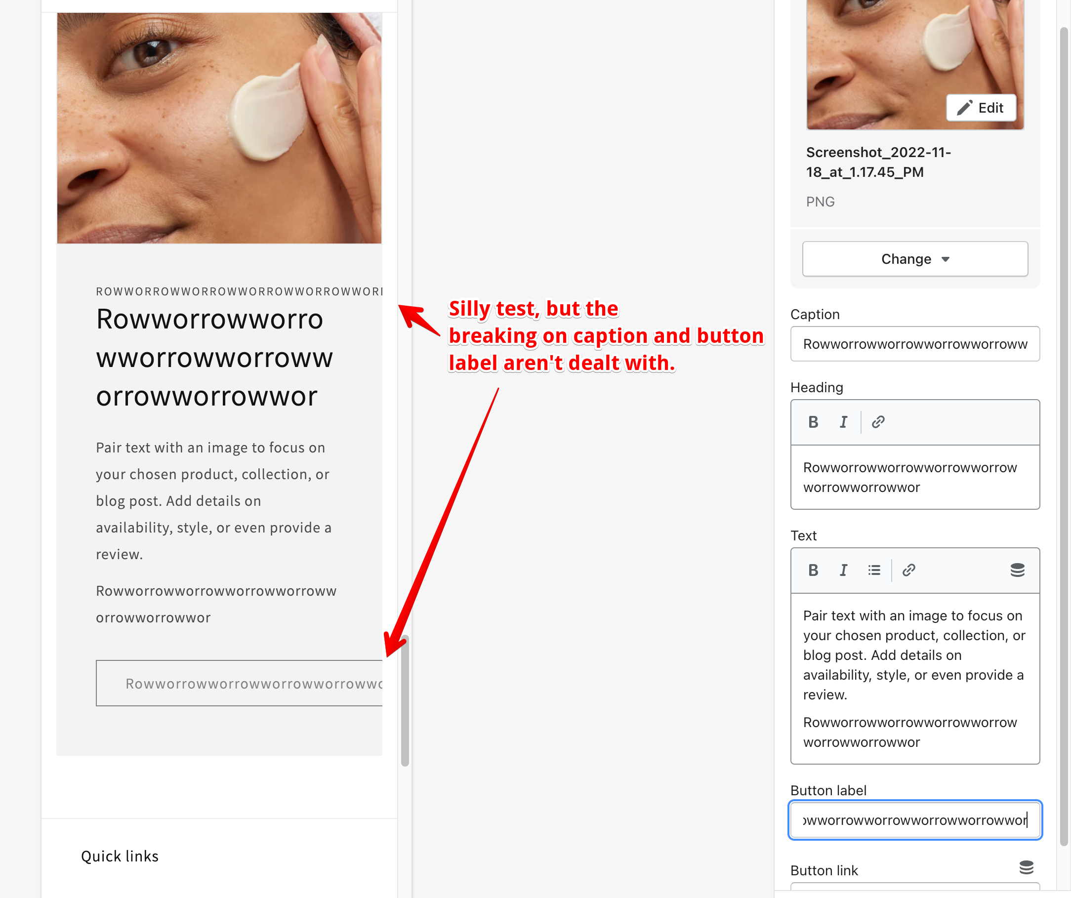
Just a note of longer words that don't break. It's more general than specific to this PR though:
Screenshot
There was a problem hiding this comment.
I solved this by making the existing image with text word break styles less specific 8470fda. Not sure I want to attempt to apply these more globally here, though off the top of my head I'm not sure I can think of a scenario we wouldn't want a caption or button to break. What do you think about that?
There was a problem hiding this comment.
Caption and button should break, yes! We don't want content to fall off screen. 🙏
| }, | ||
| { | ||
| "type": "select", | ||
| "id": "image_layout", |
There was a problem hiding this comment.
I find it a bit odd to have the setting that has the most visual impact on the section show up so late in the order. But because it's a desktop only setting that's maybe why I guess ?
cc: @YoannJailin
There was a problem hiding this comment.
I know we discussed this before and we were trying to keep our pattern consistent, but I've always felt this way too. Though we do default it to the alternating layout at least so the main distinguishing feature in the section will still be easily discoverable in that way.
There was a problem hiding this comment.
To align with other sections, the layout specific settings often comes at this level like it is. I think we have plenty to learn from those settings usage regardless. Thanks for this valid feedback and let's keep observing and sharing those thoughts! 🙏
|
@YoannJailin @melissaperreault I fixed some issues around the padding magic in mobile. Please review these behaviors (with text aligned left, center, and right) on mobile (and desktop I guess) and ensure the padding is the way we expect. It will be different than image with text currently. |
|
@melissaperreault to your last comment, this would be a great example of a ticket/task to add to the design polish board |
* Add multirow section

* Border collapse logic and general cleanup

* Conditionally remove content padding

* Reviewer feedback and formatting

* Setting and info updates

* Minor feedback

* Update 20 translation files

Co-authored-by: translation-platform[bot] <34770790+translation-platform[bot]@users.noreply.github.com>
PR Summary:
Added a new Multirow section for displaying related image and text content vertically.
Why are these changes introduced?
Multirow is a section conceptually similar to
multicolumn, but designed specifically for quicker and easier vertical content enumeration. Its blocks are aesthetically similar to the currentimage with textsection.Fixes #2169
What approach did you take?
Copied the liquid from image with text into a new section, without creating a shared snippet, so much of the markup will be the same. I'm not certain the added snippet complexity that would be required to support both use cases would be worth it. This may be dependent on how each section functionally evolves in the future.
Multirow loops through blocks and creates a new image with text element for each, so the way existing content elements (heading, caption, etc) are read differs a bit from image with text. Certain image with text classes that were conditional on section settings were either removed or hardcoded if the settings are not offered in multirow.
Other considerations
Color scheme + global border settings logic (Video of behavior)
I've included the same "magic" as image with text where if the container color scheme chosen matches the section background and no borders or shadow styles are applied via global content container settings. This allows either a unified container look or a container-less/transparent look. The only difference here is that multirow also allows the option to change the section background so this logic isn't solely linked to background-1
Shadow stacking limitations (Video of behavior)
When vertical shadow offsets for either the global media or content container settings are negative (upward), the shadow could overlap the row above (natural CSS behavior) if there isn't enough gap. The issue here is there are 2 different child elements within an image with text creating their own shadows with an existing stacking relationship of their own, which further adds to the complexity that we've been able to solve for in other sections. I briefly timeboxed a fix for this and didn't find a configuration that worked, but I don't think it's blocking.
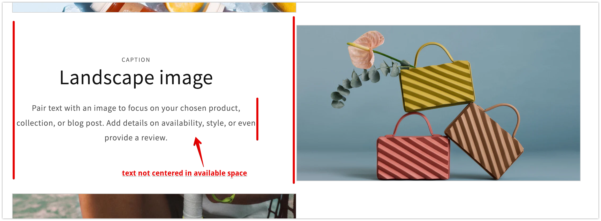
Color scheme + padding logic (Image of behavior)
We also aligned to include additional logic to better align the text content with the standard page margins when both color scheme settings are the same and the rows don't create the "container" look. Basically it just removes the appropriate left or right padding depending on the row's content alignment. An exception is also made for centered text.
Decision log
- To allow for connection to dynamic source groups
- More granularity at the block level would be more tedious and time consuming
- Less options, less configuration time for merchants
- Easier to add settings later than take some away
- Keeps things simpler
- Snippet would need to be completely agnostic of
section.settingsandblock.settingsreferences resulting in a lot of props- New logic specific to one component will require adding an exception in the shared snippet
- I'm not confident if shared liquid here will be beneficial or a burden
- New shared logic will need to be duplicated
Visual impact on existing themes
Multirow is a new section and any changes to image with text styles should be scoped to the multirow context, with one minor exception.. Long words that might not have broken in image with text captions or buttons before should break now (example)
Testing steps/scenarios
Note:Image height: mediumsetting may not apply correctly until the PR that adds the styles for this is merged and this one is rebased.Demo links
Checklist