Add constrain media and media fit settings to product page #2052
Conversation
|
The constrain media setting is looking good! 🎉 |
786b4c1 to
8046aed
Compare
| } | ||
| } | ||
|
|
||
| .product-media-container.constrain-height.media-fit-contain { |
There was a problem hiding this comment.
I'm not sure this needs as much specificity, this seems to work both on mobile and desktop:
| .product-media-container.constrain-height.media-fit-contain { | |
| .media-fit-contain { |
There was a problem hiding this comment.
I intend for media-fit-contain/cover and constrain-height to become the common naming conventions for any section to offer either of these features, so cutting out .product-media-container would probably be shortsighted even if it's not required presently.
I know you didn't have the full picture with the media fit setting when you first looked, but for context, these other classes and the specific combinations of them are deliberate and shouldn't be removed for specificity. I did think about using :where() for maintaining minimal specificity in these cases, but decided against it because browser support is still relatively recent, just barely being within our requirements.
8046aed to
7582e60
Compare
It's just an option. Like any of our settings, it might work for some shops better than others. For some, leaving constrain off and instead using shorter images or the small/medium media width options may be the better approach. Not to say we shouldn't look for opportunities to tweak it, but the general approach and its caveats have been considered and discussed extensively. @ludoboludo |
7582e60 to
c0f4942
Compare
There was a problem hiding this comment.
Looking good! 🎉
Tested:
- Desktop, tablet, mobile views
- New setting labels and order
- Desktop and mobile layouts (stacked, thumbs, thumb carousel, hide thumbs)
- Breakpoints
- Minimum image heights for desktop and mobile to stop scaling down
- Combination of new settings: media fit, constrain media toggle with desktop media width options
- Default settings for Dawn
- All media types with multiple medias (3D images, videos)
- Different aspect ratios (square, portrait, landscape)
- Borders and global settings
- Media fit options on desktop and mobile
- Image zoom
c0f4942 to
6ab47ff
Compare
There was a problem hiding this comment.
I couldn't find a way to break tbh. So it's looking good to me. I might have more scenarios that come to mind later.
One thing Im wondering is if we have considered having a separation of those behaviour based on breakpoint like we do for the desktop and mobile layout.
I'm wondering if it's something you'd want to apply on desktop only and use a different combination on mobile.
So for example, you could mitigate the spacing between images in the slider on mobile by using fill along with Constrain media to screen size while on desktop you might not want to use the fill 🤔
Also this is the type of thing that could be looked into in the future once we get merchant feedback on the existing functionality.
assets/section-main-product.css
Outdated
| @media screen and (max-width: 749px) { | ||
| .product-media-container.media-fit-cover { | ||
| /* allow media to vertically fill available mobile slide space */ | ||
| display: flex; | ||
| align-self: stretch; | ||
| } | ||
|
|
||
| .product-media-container.media-fit-cover .media { | ||
| /* allow media img element to scale relative to modal-opener/product-media-container */ | ||
| position: initial; | ||
| } | ||
| } |
There was a problem hiding this comment.
Little nitpick. This could be moved before the media query @media screen and (min-width: 750px) { on line 1387 🤔
There was a problem hiding this comment.
I think this and next comment could be address to tidy up the stylesheet 👍
There was a problem hiding this comment.
So, moving that made me want to move other stuff. I struggled to find an order I liked for these things. It should have more of a base > mobile > desktop order to it now. Should be safe enough but wouldn't hurt to give things a quick run through to make sure the reordering didn't expose any specificity traps 7bd9b03
snippets/product-thumbnail.liquid
Outdated
| @@ -51,8 +50,8 @@ | |||
| {%- endcapture -%} | |||
|
|
|||
| <div | |||
| class="product-media-container gradient global-media-settings" | |||
| style="--ratio-percent: {{ preview_media_ratio }}%;" | |||
| class="product-media-container media-type-{{ media.media_type }} media-fit-{{ media_fit }}{% if constrain_to_viewport %} constrain-height{% endif %} gradient global-media-settings" | |||
There was a problem hiding this comment.
I tend to prefer having conditional classes at the end rather than in the middle. I find the whole thing easier to read.
Like this:
| class="product-media-container media-type-{{ media.media_type }} media-fit-{{ media_fit }}{% if constrain_to_viewport %} constrain-height{% endif %} gradient global-media-settings" | |
| class="product-media-container media-type-{{ media.media_type }} media-fit-{{ media_fit }} gradient global-media-settings{% if constrain_to_viewport %} constrain-height{% endif %}" |
Any thoughts?
There was a problem hiding this comment.
We never aligned on this formally as a team. I don't feel too strongly about pushing back in this particular case, so I've made the change but I'm not always sold on basing the order of classes on the arbitrary decision to include an inline conditional or not. gradient for a example is a much more generic global class and we usually like to order those after more specific classes. Again it's a bit of a toss up here if gradient and media-settings are more generic than constrain-height, but that's how I think about it.
class=”grid grid--2-col has-border show-heading-or-something slider {% if show_slider_desktop %} slider–desktop{% endif %}{% if some_setting %} grid--1-col{% endif %}”
Also consider this ^ example, grid--1-col gets moved to the end and is now harder to associate with other relevant related classes. I don't like that and that doesn't make this code any easier to understand in the editor or in the browser inspector
Entirely a possibility, but it was preferable to try and do more with fewer settings initially and adjust when we have more data to go off of @ludoboludo |
| @@ -111,9 +110,9 @@ | |||
|
|
|||
| {%- if media.media_type != 'image' -%} | |||
| {%- if media.media_type == 'model' -%} | |||
| <product-model class="deferred-media media media--transparent no-js-hidden" style="--ratio-percent: 100%;" data-media-id="{{ media.id }}"> | |||
| <product-model class="deferred-media media media--transparent no-js-hidden" data-media-id="{{ media.id }}"> | |||
There was a problem hiding this comment.
Not a blocker, but something I'd like to bring up regarding previous context from product media just to ensure we log this as a future decision in case we're overriding a past UX decision.
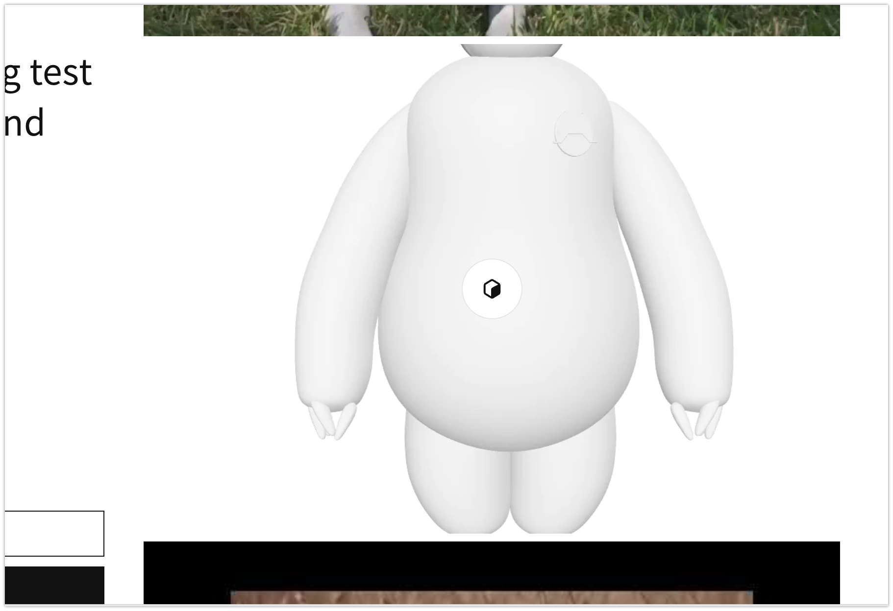
I remember we decided back in 2019 when 3D models were introduced to always display them in 1:1 aspect ratio. The rationale was that Shopify automatically generates a square poster image for uploaded 3D models, so this would ensure a smooth transition between the poster and the model's initial position. With the changes on this PR, 3D models can now be seen in any aspect ratio when the Media fit: Fill is enabled. This leads to a less smooth transition as you can see in the video below.
08-19-7jpi3-8bdmc.mp4
Because this is a setting and we're not changing the default behaviour, I think this is probably fine. If we were to force 3D models to be square would add a layer of "magic" to the setting and make it less clear.
I could not find the documentation to support this "always use square" principle, though, so I will cc @melissaperreault to see if she has any context from that time that could be relevant.
There was a problem hiding this comment.
By default we preserve the existing 1:1 ratios for models, but you are correct, when using media fit: fill there are scenarios we they can diverge from that. I believe these cases a fairly minimal as I understand, but I'll outline them below for clarity. Let me know if I'm missing any.
- In cases of
media_fit: fillanddesktop_layout: 2 columnsand model shares a row with a portrait image. If the other image on the same row is a landscape or also square, the model media shouldn't crop. Particularly if 1:1 is the most common product image ratio, this should be an infrequent combination.
- In cases of
media_fit: fillandconstrain: trueand viewport is small enough to constrain even square images. This can happen on tablet/desktop whenever models render fullwidth in the media column. I don't think this feel this will be super common either, but I do I think this is more likely to occur than the other scenario, especially if we were to default the constrain setting to true/on.
If we were to force 3D models to be square would add a layer of "magic" to the setting and make it less clear
Just want to mention this is an option of course, particularly for cases when the models are fullwidth (anything but desktop layout: 2 columns), but it would indeed be an unpredictable exception to the setting, which as I understand is our main issue with it. I also don't love the idea of doing this for the 2 column layout anyway just because it would create the vertical whitespace that the media fit setting specifically provides an option to prevent.
7bd9b03
|
I've made all the actionable updates requested, mostly updates to settings language and minor code formatting changes. I will also request translations pending UX re-approval. |
e465f33
)

* Add constrain height setting

* Add constrain scaling functionality

* Add media fit setting and functionality

* Quick add override and typo fixes

* Update setting language and code cosmetics

* Update 8 translation files

* Update 5 translation files

* Update 3 translation files

* Update 3 translation files

* Update 1 translation file

* Add comment

Co-authored-by: translation-platform[bot] <34770790+translation-platform[bot]@users.noreply.github.com>
commit dc81806
Author: Ken Meleta <30790058+kmeleta@users.noreply.github.com>
Date:   Tue Nov 22 13:32:46 2022 -0700

    Add media sizing settings to featured product (Shopify#2114)

commit 9875aea
Author: Ken Meleta <30790058+kmeleta@users.noreply.github.com>
Date:   Tue Nov 22 13:17:55 2022 -0700

    Adjust constrain media values for quick add modal (Shopify#2113)

    * Adjust constrain media values for quickadd

    * Adjust offset logic

    * Minor formatting fix

commit 2eb8bf6
Author: Ludo <ludo.segura@shopify.com>
Date:   Tue Nov 22 11:50:50 2022 -0500

    Add fixed sizes for some images to prevent errors (Shopify#2087)

    * remove the mention of sizes where unnecessary

    * remove another instance

    * add fixed size to the images in structured data

    * adjust size to 1920

    * edit logo size in structured data

    * remove conditional info

    * change value to match other logo size values

commit 2f9b9f3
Author: Ludo <ludo.segura@shopify.com>
Date:   Mon Nov 21 15:44:24 2022 -0500

    Remove alt attribute in image_tag filter where unnecessary  (Shopify#2117)

    * Add fallback to alt attribute where image_tag filter is used

    * remove unnecessary use of alt attribute in image_tag filter

commit 251e5d9
Author: Ludo <ludo.segura@shopify.com>
Date:   Mon Nov 21 12:18:44 2022 -0500

    Move share button into a snippet (Shopify#2123)

    * Move share button into a snippet

    * change the property name to context and add details in snippet

    * address review comments

    * edit props names and description

    * Address reviewers comment. Remove unused prop and edit existing ID

    * move script at the top

commit 539af27
Author: Eugene Kasimov <105315663+eugenekasimov@users.noreply.github.com>
Date:   Mon Nov 21 09:01:58 2022 -0800

    Prettier liquid files snippets. (Shopify#2115)

commit 503fdf8
Author: Eugene Kasimov <105315663+eugenekasimov@users.noreply.github.com>
Date:   Thu Nov 17 08:51:21 2022 -0800

    Remove noscript css import for product recommendations (Shopify#2101)

commit b2b01fd
Author: Eugene Kasimov <105315663+eugenekasimov@users.noreply.github.com>
Date:   Thu Nov 17 08:50:33 2022 -0800

    Change variables names (Shopify#2055)

commit cf05d0d
Author: Francisca Calabria Rubio <13103124+FCalabria@users.noreply.github.com>
Date:   Thu Nov 17 16:50:55 2022 +0100

    Select text input content on trapFocus (Shopify#2106)

    * Select text input content on trapFocus

    * PR fix

commit b86d1f3
Author: Ken Meleta <30790058+kmeleta@users.noreply.github.com>
Date:   Thu Nov 17 08:50:43 2022 -0700

    Change thumbnail media fit to "fill" by default (Shopify#2044)

    * Change thumbnail media fit to cover by default

    * Simplify and cleanup thumbnail fit approach

commit 8ab8e61
Author: Ludo <ludo.segura@shopify.com>
Date:   Thu Nov 17 10:50:28 2022 -0500

    Tweak the image_url size to be the max value where necessary (Shopify#2110)

    * Tweak the image_url size to be the max value where necessary

    * fix sizing in the header.

commit c337301
Author: translation-platform[bot] <34770790+translation-platform[bot]@users.noreply.github.com>
Date:   Thu Nov 17 10:49:52 2022 -0500

    Update 1 translation file (Shopify#2130)

    Co-authored-by: translation-platform[bot] <34770790+translation-platform[bot]@users.noreply.github.com>

commit bc8f433
Author: Ken Meleta <30790058+kmeleta@users.noreply.github.com>
Date:   Thu Nov 17 08:49:10 2022 -0700

    Add constrain media and media fit settings to product page (Shopify#2052)

    * Add constrain height setting

    * Add constrain scaling functionality

    * Add media fit setting and functionality

    * Quick add override and typo fixes

    * Update setting language and code cosmetics

    * Update 8 translation files

    * Update 5 translation files

    * Update 3 translation files

    * Update 3 translation files

    * Update 1 translation file

    * Add comment

    Co-authored-by: translation-platform[bot] <34770790+translation-platform[bot]@users.noreply.github.com>
)

* Add constrain height setting

* Add constrain scaling functionality

* Add media fit setting and functionality

* Quick add override and typo fixes

* Update setting language and code cosmetics

* Update 8 translation files

* Update 5 translation files

* Update 3 translation files

* Update 3 translation files

* Update 1 translation file

* Add comment

Co-authored-by: translation-platform[bot] <34770790+translation-platform[bot]@users.noreply.github.com>
PR Summary:
Added two new settings to improve flexibility around sizing media on the product page.
Why are these changes introduced?
Fixes #2004
Fixes #2016
Adds a
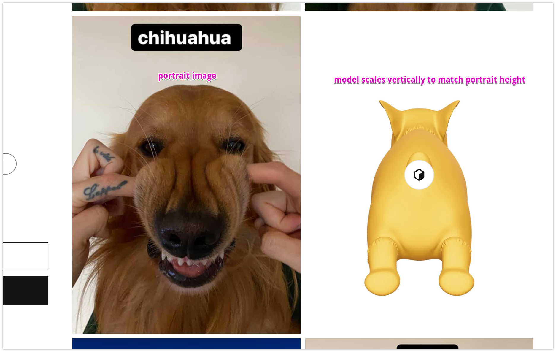
Constrain media to screen sizesettingTaller product images often display too large on the product page to view the whole image without scrolling. This is exacerbated when using the "Large" desktop media size setting. This new boolean setting effectively sets a max media height and scales down or "constrains" the media based on the height of the viewport.
Adds a
Media fitsettingWhen images are constrained or a product has a variety of aspect ratios, whitespace is created in certain layouts. This new setting gives the option to
Fillwhatever space is created by layout. Think of fill asobject-fit: coverand the default/original setting as more ofobject-fit: contain.What approach did you take?
Determining the constrained height
The main priority is to constrain the image enough to where it can entirely fit in the viewport. This is not necessarily the same as fitting within the fold, as there are too many variables that would need to be dynamically factored in to always ensure this is the case (padding and margin, logo size, announcement bar, etc). I'm using a simple a `100vh` minus an arbitrary amount of offset. This offset varies for mobile and desktop breakpoints and was chosen to meet the design needs of this feature in a majority of theme configurations.Determining the constrained width
In order to play nice with the way our product media items are built (and prevent cumulative layout shift), I decided to explicitly calculate the proportional scaled width as a percent using the image's aspect ratio. This width is applied to the `.product media-container` element, which is now the parent element of everything in `product-thumbnail.liquid` (media, deferred media, modal opener, badges, etc).Any global media styles (like border and shadow) are now also applied to the same element so these styles stay tied to the proper scaled image dimensions. For context, the work I did in #2022 was to better facilitate this approach.
Applying the settings via classes
The constrain height setting defaults to off, but when true, is applied via a `constrain-height` class in the `product-thumbnail` snippet. Along with that there is `media-fit-contain` or `media-fit-cover` class to support the value of the media fit setting. I'm basing these names/terms on the object-fit CSS property rather than the end user facing language shown in the editor. "contain" represents the "original" media fit behavior and "cover" represents the "fill" behavior.Using css variables to modify ratio context
I made some modifications to the way aspect ratios are passed to the CSS in order to account for the differences in mobile and desktop deferred-media behavior and the effect of the media fit options.You'll notice all ratio-related variable context is now defined on the root product-media-container element so that changes in those values are easy to track and make sense of. I did need to add a `media-type-{{media.type}}` class on this element to facilitate this and avoid making `modal-opener--{{media-type}}` responsible for modifying variable context in one case, but I see that as more logical place for that type of modifier class anyway.
Applying the cover/fill media fit
CSS does have the object-fit property which is applied to most media images by default. So most of the work here is around ensuring the height or width of the media containers are actually taking 100% of their allocated space. The approach to this varies a bit by case.Other considerations
General behavior
If images cannot fit vertically in the viewport, they will be scaled down and centered in the available column space.
https://screenshot.click/19-13-3re96-lqsv7.mp4
Effect on horizontal spacing
The layout spacing between images on the same row will appear to be disregarded if images the images need to scale. This is most prominent on mobile where images are always on the same row
https://screenshot.click/19-06-0vcj3-8ln4p.mp4
Portrait image considerations
In some layouts where images are in a 2 column configuration, constraining of these images is still a possibility if the images are tall enough, even with a maximum constrain value in place.
https://screenshot.click/19-15-cbr8t-erodp.mp4
On the tablet breakpoint, it is also likely to see multiple [portrait] images being constrained
https://screenshot.click/19-20-1z06k-8xvsw.mp4
Effect on deferred media
Videos/3d models on PDP will also be affected by the constrain setting (most commonly on mobile) and the media fit setting. It's worth noting that on desktop, the aspect ratio used for the media item is that of the actual video or model source. Not the preview/poster image. If a poster of a different aspect ratio is used, there will be white space around the image. Using media fit: fill, provides an option to mitigate that, but ideally merchants provide a properly sized poster image. We can always change this behavior, but that would be another discussion.
https://screenshot.click/26-03-ozqxw-e27m0.mp4
Visual impact on existing themes
Constrain media: Product images could scale with new constrain setting on. No visual impact with the setting off. No visual impact for images that already fit within the viewport. Portrait images will be the most effected.
Media fit fill: Images that are scaled by the constrain setting and images [horizontally] adjacent to taller images will be scaled up to fill the whitespace left and those images may be partially cropped. With the constrain setting off or inapplicable, the media fit setting should have no noticeable effect on products using images with the same aspect ratio.
Testing steps/scenarios
Demo links
Checklist