Skip to content
New issue

Have a question about this project? Sign up for a free GitHub account to open an issue and contact its maintainers and the community.

By clicking “Sign up for GitHub”, you agree to our terms of service and privacy statement. We’ll occasionally send you account related emails.

Already on GitHub? Sign in to your account

Style and remove "Save" button for Default Room Settings #8164

Merged
merged 10 commits into from
Mar 16, 2022

Conversation

nickmurray47
Copy link
Contributor

@nickmurray47 nickmurray47 commented Mar 15, 2022

Details

"Save" button is hidden for default/archived rooms and updated the style.

Fixed Issues

$ GH_LINK

Tests / QA Steps

  1. See default room - either #announce or #admins
  2. Click room avatar
  3. Click settings
  4. Verify "Save" button is no longer visible and text inputs are just text.
  5. Click "+" Global create, create a new room, add name and in the new room's settings, verify you can edit and save the name of the room but not the workspace.

PR Review Checklist

Contributor (PR Author) Checklist

  • I verified the PR has a small number of commits behind main
  • I linked the correct issue in the ### Fixed Issues section above
  • I wrote clear testing steps that cover the changes made in this PR
    • I clearly indicated the environment tests should be run in (Staging vs Production)
  • I wrote testing steps that cover success & fail scenarios (if applicable)
  • I included screenshots or videos for tests on all platforms
  • I ran the tests & verified they passed on:
    • iOS / native
    • Android / native
    • iOS / Safari
    • Android / Chrome
    • MacOS / Chrome
    • MacOS / Desktop
  • I verified there are no console errors related to changes in this PR
  • I followed proper code patterns (see Reviewing the code)
    • I added comments when the code was not self explanatory
    • I put all copy / text shown in the product in all src/languages/* files (if applicable)
    • I followed proper naming convention for platform-specific files (if applicable)
    • I followed style guidelines (in Styling.md) for all style edits I made
    • I followed the JSDocs style guidelines (in STYLE.md)
  • I followed the guidelines as stated in the Review Guidelines
  • I tested other components that can be impacted by my changes (i.e. if the PR modifies a shared library or component like Avatar, I verified the components using Avatar are working as expected)
  • I corroborated the UI performance was not affected (the performance is the same than main branch)
  • If I created a new component I verified that a similar component doesn't exist in the codebase

PR Reviewer Checklist

  • I verified the PR has a small number of commits behind main
  • I verified the correct issue is linked in the ### Fixed Issues section above
  • I verified testing steps are clear and they cover the changes made in this PR
    • I verified the testing environment is mentioned in the test steps
  • I verified testing steps cover success & fail scenarios (if applicable)
  • I checked that screenshots or videos are included for tests on all platforms
  • I verified tests pass on all platforms & I tested again on:
    • iOS / native
    • Android / native
    • iOS / Safari
    • Android / Chrome
    • MacOS / Chrome
    • MacOS / Desktop
  • I verified there are no console errors related to changes in this PR
  • I verified proper code patterns were followed (see Reviewing the code)
    • I verified comments were added when the code was not self explanatory
    • I verified any copy / text shown in the product was added in all src/languages/* files (if applicable)
    • I verified proper naming convention for platform-specific files was followed (if applicable)
    • I verified style guidelines were followed
    • I verified the JSDocs style guidelines (in STYLE.md) were followed
  • I verified that this PR follows the guidelines as stated in the Review Guidelines
  • I verified other components are not impacted by changes in this PR (i.e. if the PR modifies a shared library or component like Avatar, I verified the components using Avatar are working as expected)
  • I verified the UI performance was not affected (the performance is the same than main branch)
  • If a new component is created I verified that a similar component doesn't exist in the codebase

Screenshots

Web

default room
Screen Shot 2022-03-15 at 1 35 23 PM

new room
Screen Shot 2022-03-16 at 3 25 02 PM

Mobile Web

Screen Shot 2022-03-16 at 12 39 55 PM
Screen Shot 2022-03-16 at 12 55 20 PM

Desktop

Screen Shot 2022-03-15 at 2 45 38 PM

Screen Shot 2022-03-16 at 3 25 02 PM

iOS

Screen Shot 2022-03-16 at 12 20 25 PM
Screen Shot 2022-03-16 at 3 10 41 PM

Android

Screen Shot 2022-03-15 at 3 05 33 PM

![Screen Shot 2022-03-16 at 4 11 15 PM](https://user-images.githubusercontent.com/24466196/158706139-46b14b7e-da89-46fd-8023-16470bbf4578.png)

@nickmurray47 nickmurray47 requested a review from a team as a code owner March 15, 2022 18:44
@nickmurray47 nickmurray47 self-assigned this Mar 15, 2022
@MelvinBot MelvinBot requested review from bondydaa and removed request for a team March 15, 2022 18:44
@nickmurray47 nickmurray47 changed the title Style and remove "Save" button for Default Room Settings [WIP] Style and remove "Save" button for Default Room Settings Mar 15, 2022
@nickmurray47
Copy link
Contributor Author

cc @shawnborton what do you think of the initial Web screenshot?

@shawnborton
Copy link
Contributor

Just to make sure I am following, in this case the room name input is not editable right? Same with the workspace input?

@nickmurray47
Copy link
Contributor Author

in this case the room name input is not editable right? Same with the workspace input?

Correct, they are both not editable. Should we make that clear to the end-user? We could gray the text box out.

@shawnborton
Copy link
Contributor

I was thinking we'd use this pattern when the input is read-only and can't be edited:
image

@nickmurray47
Copy link
Contributor Author

got it, will update

@nickmurray47
Copy link
Contributor Author

Screen Shot 2022-03-15 at 1 10 44 PM

@shawnborton
Copy link
Contributor

So close! Final details would be that the total height of the small label + value should be 40px:
image

And we get that by making that upper label have a line height of 16px, a bottom margin of 4px, and then the value below has a line height of 20px.

@nickmurray47
Copy link
Contributor Author

nickmurray47 commented Mar 15, 2022

How do we feel about the lefthand spacing difference between the picker and the two labels below it? Also looks a little off to me but not sure if that's intended.

Screen Shot 2022-03-15 at 1 35 23 PM

@shawnborton
Copy link
Contributor

I think it's okay for now. Ideally at some point we will convert the notifications select menu to be a "push input" and the page would look like this:
image

And tapping that would take you to a new page.

bondydaa
bondydaa previously approved these changes Mar 16, 2022
Copy link
Contributor

@bondydaa bondydaa left a comment

Choose a reason for hiding this comment

The reason will be displayed to describe this comment to others. Learn more.

no blockers from me, going to tap someone else who's actually written App code though too.

@nickmurray47 nickmurray47 changed the title [WIP] Style and remove "Save" button for Default Room Settings Style and remove "Save" button for Default Room Settings Mar 16, 2022
@nickmurray47
Copy link
Contributor Author

screenshots and review comments updated, gonna pull in one more App reviewer!

@stitesExpensify stitesExpensify self-requested a review March 16, 2022 19:43
@shawnborton
Copy link
Contributor

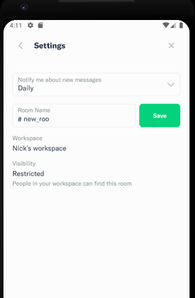
How exactly does the visibility: restricted stuff work? I feel like that should look identical to the sections above it where "Visibility" is in the smaller gray text.

@nickmurray47
Copy link
Contributor Author

How exactly does the visibility: restricted stuff work?

It's a setting you adjust when you create the room, it seems. "Private" is invite-only and "Restricted" means that anyone in the workspace can see it.

I feel like that should look identical to the sections above it where "Visibility" is in the smaller gray text.

Would the "Visibility" + restricted/private appear on the same line? It seems like for this setting we have three sections.

@nickmurray47
Copy link
Contributor Author

How does this look @shawnborton?
Screen Shot 2022-03-16 at 12 55 20 PM

@shawnborton
Copy link
Contributor

shawnborton commented Mar 16, 2022 via email

@nickmurray47
Copy link
Contributor Author

checks pass, ready for review @stitesExpensify @bondydaa

@shawnborton
Copy link
Contributor

Nice, I think you just need to update the screenshots given the "Visibility" changes and then we're good.

@nickmurray47
Copy link
Contributor Author

screenshots updated, gonna merge soon

@shawnborton
Copy link
Contributor

I'll go ahead and merge this one.

@shawnborton shawnborton merged commit 2c7c82c into main Mar 16, 2022
@shawnborton shawnborton deleted the nmurray-update-room-settings-page branch March 16, 2022 23:21
@OSBotify
Copy link
Contributor

✋ This PR was not deployed to staging yet because QA is ongoing. It will be automatically deployed to staging after the next production release.

@OSBotify
Copy link
Contributor

🚀 Deployed to staging by @shawnborton in version: 1.1.44-0 🚀

platform result
🤖 android 🤖 success ✅
🖥 desktop 🖥 success ✅
🍎 iOS 🍎 success ✅
🕸 web 🕸 success ✅

Sign up for free to join this conversation on GitHub. Already have an account? Sign in to comment
Labels
None yet
Projects
None yet
Development

Successfully merging this pull request may close these issues.

5 participants