Improve the styling of Woofmark buttons on pl.org/post #7067
Comments
|
@nstjean This FTO is the "second" part of the publiclab/PublicLab.Editor#378 issue. I would like your opinion on this change :) |
|
Hi, can I claim this issue? |
|
@yihenghuang Happy New Year 🎉 |
|
@VladimirMikulic Thanks for making these FTOs! This is great! the only thing I'm not sure about is adding in the space between buttons, they may prefer it to look like a toolbar. @cesswairimu maybe you can weigh in? |
|
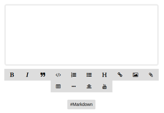
@nstjean thanks, I try to do my best. This is how it looks like without spacing in between.
I am not a designer, but the general rule is to allow users to "breathe". It's easier for the eyes. |

|
I also think that without spaces gives it the toolbar feel. But I see what @VladimirMikulic you mean with giving the usability being affected...Maybe we could partition it but still have it as whole as it is in PublicEditor samples What do you both think? Thanks all |

|
@cesswairimu, unfortunately, we can't have it as a "whole" toolbar. Icons would be very small. Mobile screens are too small for the "whole" toolbar. It needs to be in multiple rows :) |
|
My thinking was to have it as this |


|
@cesswairimu it's your call :)
Personally I like the first option, but again it's up to you and @nstjean to decide what is better. |

|
I like it all together, so the second option. :) What about you @cesswairimu ? |
|
Yeah I agree with @nstjean, the second option looks great. |
|
@cesswairimu @nstjean Awesome! Thank you both for your help. The issue is updated accordingly. |
|
@VladimirMikulic Hi sorry for the late feedback. I try to follow your instruction but didnt find any comment at line 342. Please feel free to reject my PR if the code was not inserted at an organized location. Thanks for helping me through my first contribution! |
|
@yihenghuang Apparently someone removed the comment. Your change works fine :) |
|
I am working on this one @VladimirMikulic |
|
@developer22-university sorry. @yihenghuang unexpectedly submitted a PR. If you still want to contribute, try this one publiclab/mapknitter#1193 Thanks. |
|
The issue has been solved. |
|
This issue is still present. @yihenghuang I would appreciate if you could submit a PR for this. |
|
Hi all, i believe this is still available for folks to claim? |
|
Does anyone has claimed this issue or is it available? |
|
@VladimirMikulic, I would like to work on this issue, to start my first contribution to this repo. Can you please assign it to me so that I can work on it... |
|
Hi @Prerna-0202. It's all yours :) |
Hi, this is a first-timers-only issue. This means we've worked to make it more legible to folks who either haven't contributed to our codebase before, or even folks who haven't contributed to open source before.
If that's you, we're interested in helping you take the first step and can answer questions and help you out as you do. Note that we're especially interested in contributions from people from groups underrepresented in free and open source software!
We know that the process of creating a pull request is the biggest barrier for new contributors. This issue is for you 💝
If you have contributed before, consider leaving this one for someone new, and looking through our general help wanted issues. Thanks!
🤔 What you will need to know.
Nothing. This issue is meant to welcome you to Open Source :) We are happy to walk you through the process.
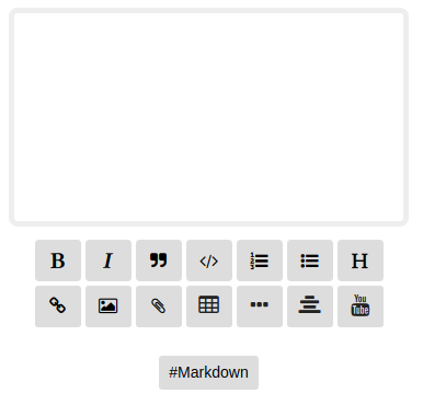
🔥 Problem
As you can see on the image above, we have some serious issues with our new editor on https://publiclab.org/post. Buttons are overflowing its container, disappearing and causing horizontal scroll bars.
It's even worse on mobile devices and this should be patched ASAP.
🚩 Goal
📋 Step by Step
🙋 Claim this issue: Comment below. If someone else has claimed it, ask if they've opened a pull request already and if they're stuck -- maybe you can help them solve a problem or move it along!
📝 Open the file plots2/app/assets/stylesheets/style.css
Line 342, after the comment, add this code:
See this page for some help in taking your first steps!
Below is a "diff" showing in red (and a
-) which lines to remove, and in green (and a+) which lines to add:💾 Commit your changes
🔀 Start a Pull Request. There are two ways how you can start a pull request:
If you are familiar with the terminal or would like to learn it, here is a great tutorial on how to send a pull request using the terminal.
You can also edit files directly in your browser and open a pull request from there.
Please keep us updated
💬⏰ - We encourage contributors to be respectful to the community and provide an update within a week of claiming the first-timers-only issue. We're happy to keep it assigned to you as long as you need if you update us with a request for more time or help, but if we don't see any activity a week after you claim it we may reassign it to give someone else a chance. Thank you in advance!
If this happens to you, don't sweat it! Grab another open issue.
Is someone else already working on this?
🔗- We encourage contributors to link to the original issue in their pull request so all users can easily see if someone's already started on it.
👥- If someone seems stuck, offer them some help! Otherwise, take a look at some other issues you can help with. Thanks!
🤔❓ Questions?
Leave a comment below!
The text was updated successfully, but these errors were encountered: