SizeDefinition
After reviewing the MSDN documentation for the Windows Ribbon Framework I’ve discovered there is only one subject I haven’t covered in my ribbon posts. This post comes to rectify this issue.
This post is about how to define custom size definitions for ribbon group elements. The post is entirely about ribbon markup, so no changes to the Windows Ribbon for WinForms library.
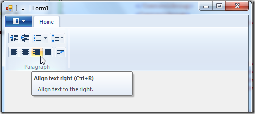
Nevertheless, I’ve uploaded a new sample “18-SizeDefinition” to the project site. In this sample I create the paragraph group which you can find in WordPad application. What’s special about this group is the custom layout it represents.
What is SizeDefinition? SizeDefinition is the ribbon markup element which allows us, developers, to control the layout of controls in a group. Every such definition is called layout template. Specifying proper sizing and scaling policies for the ribbon can be the most tricky part of the design process, but it pays off with a better user experience.
Every group can scale to the following sizes: Large, Medium, Small and Popup. This allows the ribbon framework to show the UI even when we don’t have a lot of screen space.
!Note:
Scaling, which has an important impact on how your group will look was already reviewed in Windows Ribbon for WinForm, Tabs, Groups and HelpButton.
Every layout template includes:
-
List of controls participating in the group
-
A definition of a layout for a given group size.
Predefined Layout Templates Microsoft has provided predefined common layout template so we can use them on our groups without having to specify the exact layout. Up until now, all the previous samples used them.
Reminder:
<Group CommandName=“cmdGroupFileActions“ SizeDefinition=“ThreeButtons“>
  <Button CommandName=“cmdButtonNew“ />
  <Button CommandName=“cmdButtonOpen“ />
  <Button CommandName=“cmdButtonSave“ />
</Group>
The “ThreeButtons” is a name of a predefined layout template that handles the layout for 3 button controls.
Here is a boring list of available predefined templates:
- OneButton
- TwoButtons
- ThreeButtons
- ThreeButtons-OneBigAndTwoSmall
- ThreeButtonsAndOneCheckBox
- FourButtons
- FiveButtons
- FiveOrSixButtons
- SixButtons
- SixButtons-TwoColumns
- SevenButtons
- EightButtons
- EightButtons-LastThreeSmall
- NineButtons
- TenButtons
- ElevenButtons
- OneFontControl
- OneInRibbonGallery
- InRibbonGalleryAndBigButton
- InRibbonGalleryAndButtons-GalleryScalesFirst
- ButtonGroups
- ButtonGroupsAndInputs
- BigButtonsAndSmallButtonsOrInputs
Their exact layout can be found at Customizing a Ribbon Through Size Definitions and Scaling Policies on MSDN.
Defining Custom Layout Templates Custom layout templates can be defined in two ways: Inline and standalone.
Standalone definition Standalone means you define the layout once, under a Ribbon.SizeDefinitions element and then use its name in your group definition, exactly like the predefined layout templates.
For example:
Defining the named, standalone, custom layout:
<Ribbon.SizeDefinitions>
  <SizeDefinition Name=“ParagraphLayout“>
    <ControlNameMap>
      <ControlNameDefinition Name=“button1“ />
      <ControlNameDefinition Name=“button2“ />
      <ControlNameDefinition Name=“button3“ />
      <ControlNameDefinition Name=“button4“ />
      <ControlNameDefinition Name=“button5“ />
      <ControlNameDefinition Name=“button6“ />
      <ControlNameDefinition Name=“button7“ />
      <ControlNameDefinition Name=“button8“ />
      <ControlNameDefinition Name=“button9“ />
    </ControlNameMap>
    <GroupSizeDefinition Size=“Large“>
      <Row>
        <ControlGroup>
          <ControlSizeDefinition ControlName=“button1“ IsLabelVisible=“false“ />
          <ControlSizeDefinition ControlName=“button2“ IsLabelVisible=“false“ />
        </ControlGroup>
        <ControlGroup>
          <ControlSizeDefinition ControlName=“button3“ IsLabelVisible=“false“ />
        </ControlGroup>
        <ControlGroup>
          <ControlSizeDefinition ControlName=“button4“ IsLabelVisible=“false“ />
        </ControlGroup>
      </Row>
      <Row>
        <ControlGroup>
          <ControlSizeDefinition ControlName=“button5“ IsLabelVisible=“false“ />
          <ControlSizeDefinition ControlName=“button6“ IsLabelVisible=“false“ />
          <ControlSizeDefinition ControlName=“button7“ IsLabelVisible=“false“ />
          <ControlSizeDefinition ControlName=“button8“ IsLabelVisible=“false“ />
        </ControlGroup>
        <ControlGroup>
          <ControlSizeDefinition ControlName=“button9“ IsLabelVisible=“false“ />
        </ControlGroup>
      </Row>
    </GroupSizeDefinition>
  </SizeDefinition>
</Ribbon.SizeDefinitions>
Although this looks intimidating, this is actually pretty simple. First, the ControlNameMap element is a definition of placeholder’s controls used in the layout. In our example we define 9 controls.
Then comes the layout definition. This is done in a GroupSizeDefinition element, where we set as an attribute what is the group scale size we are defining. Remember that different groups sizes will have different layouts. In our example we define a layout only for large size.
Then we use the Row elements to specify that our layout comes in two lines (three lines is the maximum).
In every row we use ControlGroup elements to specify grouping of controls. Controls which are in the same group have no spacing between them.
Using the custom layout is very simple:
<Group CommandName=“cmdGroupParagraph“ SizeDefinition=“ParagraphLayout“>
  <Button CommandName=“cmdDecreaseIndent“ />
  <Button CommandName=“cmdIncreaseIndent“ />
  <SplitButton>
    <Button CommandName=“cmdStartList“ />
  </SplitButton>
  <DropDownButton CommandName=“cmdLineSpacing“>
    <Button />
  </DropDownButton>
  <Button CommandName=“cmdAlignLeft“ />
  <Button CommandName=“cmdAlignCenter“ />
  <Button CommandName=“cmdAlignRight“ />
  <Button CommandName=“cmdJustify“ />
  <Button CommandName=“cmdParagraph“ />
</Group>
Inline definition Inline means you write the layout definition inside your actual group definition. Here is the same example, only an Inline version:
<Group CommandName=“cmdGroupParagraph“>
  <SizeDefinition>
    <ControlNameMap>
      <ControlNameDefinition Name=“button1“ />
      <ControlNameDefinition Name=“button2“ />
      <ControlNameDefinition Name=“button3“ />
      <ControlNameDefinition Name=“button4“ />
      <ControlNameDefinition Name=“button5“ />
      <ControlNameDefinition Name=“button6“ />
      <ControlNameDefinition Name=“button7“ />
      <ControlNameDefinition Name=“button8“ />
      <ControlNameDefinition Name=“button9“ />
    </ControlNameMap>
    <GroupSizeDefinition Size=“Large“>
      <Row>
        <ControlGroup>
          <ControlSizeDefinition ControlName=“button1“ IsLabelVisible=“false“ />
          <ControlSizeDefinition ControlName=“button2“ IsLabelVisible=“false“ />
        </ControlGroup>
        <ControlGroup>
          <ControlSizeDefinition ControlName=“button3“ IsLabelVisible=“false“ />
        </ControlGroup>
        <ControlGroup>
          <ControlSizeDefinition ControlName=“button4“ IsLabelVisible=“false“ />
        </ControlGroup>
      </Row>
      <Row>
        <ControlGroup>
          <ControlSizeDefinition ControlName=“button5“ IsLabelVisible=“false“ />
          <ControlSizeDefinition ControlName=“button6“ IsLabelVisible=“false“ />
          <ControlSizeDefinition ControlName=“button7“ IsLabelVisible=“false“ />
          <ControlSizeDefinition ControlName=“button8“ IsLabelVisible=“false“ />
        </ControlGroup>
        <ControlGroup>
          <ControlSizeDefinition ControlName=“button9“ IsLabelVisible=“false“ />
        </ControlGroup>
      </Row>
    </GroupSizeDefinition>
  </SizeDefinition>
  <Button CommandName=“cmdDecreaseIndent“ />
  <Button CommandName=“cmdIncreaseIndent“ />
  <SplitButton>
    <Button CommandName=“cmdStartList“ />
  </SplitButton>
  <DropDownButton CommandName=“cmdLineSpacing“>
    <Button />
  </DropDownButton>
  <Button CommandName=“cmdAlignLeft“ />
  <Button CommandName=“cmdAlignCenter“ />
  <Button CommandName=“cmdAlignRight“ />
  <Button CommandName=“cmdJustify“ />
  <Button CommandName=“cmdParagraph“ />
</Group>