| Student's name | SCIPER |
|---|---|
| Polina Proskura | 328824 |
| Sophie du Couédic | 260007 |
Milestone 1 • Milestone 2 • Milestone 3
---> Website <---
10% of the final grade
Explore the words statistics in the news and tweets related to coronavirus. Find the topics, which affects people the most and how they are related to each other, display the lexical field used in the news compared to the lexical field used in the tweets.
We choose to unite several datasets concerning coronavirus, first of them with the news and second of them with the tweets of concerned people.
News datasets
- Covid fake news Dataset, by Abhishek Koirala
- Covid fake news Dataset, by Sumit Banik Tweets datasets
- Covid19 Tweets, by Gabriel Preda
Note : the news dataset concerning covid are all trying to label fake/true news. In fact, fake news are really a concern during those times, but it is not our purpose to try to classify the news, so we will simply ignore the fake/true label.
There are a lot of concerning and debating news and discussions about covid. Some of them are spreading fake information, some of them just sending panic messages. We want to explore the statistics of the texts and find the most redundants topics/words appearing in the texts, to get a grasp of the mindset of the people living this pandemic : their feelings, their concerns. The idea is also to see how the news content compares to the tweets content, to see if the news relates closely or not to what the population is really experiencing. Are the news using the same lexical field to talk about coronavirus? The second idea is to search the topics/words that relate closely to one another by afferring pairs of words that often appear in the same tweet/news (for example if “anxiety” appears often with the word “lockdown”) and make a graph of the topics related to each other.
The visualization in that case have two main purposes:
- To show to concerned people different new topics related to coronavirus to explore.
- To get of grasp of the semantic representation of coronavirus, and how it impacted the meaning of certain words that were before so irrelevant (today the word lockdown hits totally differently).
- See how the news and journalistic publication relates to (and maybe influence as well) people feelings and concerns during such an important event.
The analysis is available in Exploratory_Data_Analysis.ipynb file. The text was cleaned, normalized and lemmatized. There are data on most frequent words in the text and also most frequent bigrams, since there are topics strongly connected to each other.
Previous works with the data:
- The news datasets were used to train the classifier to detect the fake covid news and do not grow the panic in the world link.
- The tweets dataset was used to do some exploratory analysis, including the dynamics of the tweets depending on time and geography (here and here). Also, there was a classification task to predict if the tweet was positive or negative link.
Our approach: Our main idea is to visualize the words and phrases distributions among the texts. First of all, we will see the image representing the frequency of every included topic and its significance in the texts. The second idea is using text vectorization techniques to find the topics which are really close to each other in terms of covid and visualize that closeness, so we can detect really different topics concerning the people.
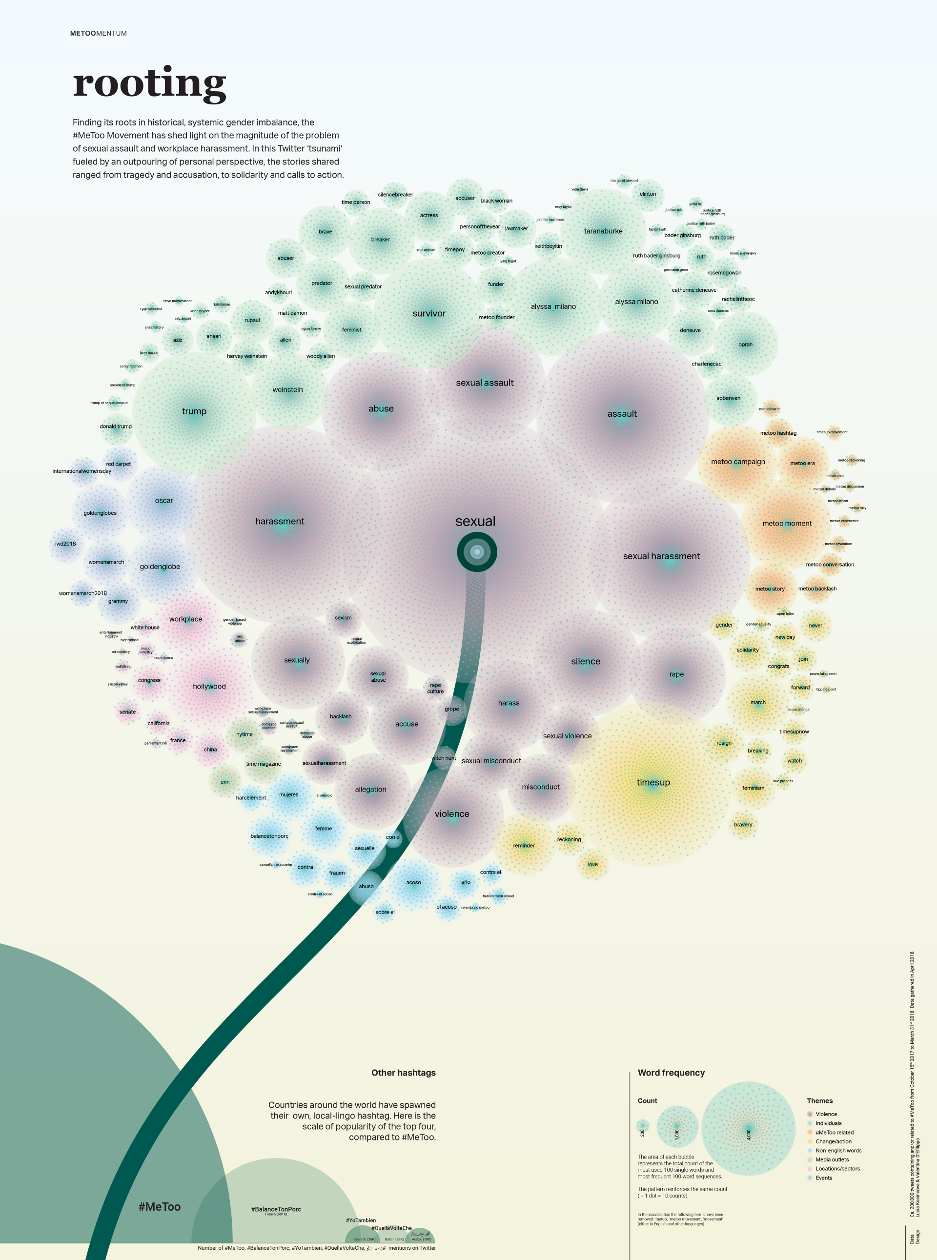
We were inspired by the visual display of the meToo work presented during the lecture, and will try to display in a similar architecture the different topics related to coronavirus.
Polina have worked with some tweets datas on the ADA and ML courses, but not with this current dataset, should I provide my work?
Ideally, the main visualization and it's related auxiliary layouts will remain on the main page. If implemented, we think that we will set a new tab per secondary visualization, namely the bicharts and the end-to-end graph.
The core visualization consist of a network of topics, tweets and news. The tweets and news will be remain on an outter circle, with the different topics in the center of that circle. The tweets/news will be linked with their topics (possibly multiple topics per tweet or news) with very thin edges. The topics are linked to each others as well, with edge's thickness depending on how often two topics appear together.
Note : there are more than twenty thousands tweets and news in our database. Such a big database was useful to derive a representative topics, but we will display only a small subset of the tweets and the news in the outer circle.

Recall that the main goal is to compare the semantic fields used in the news and the tweets. Therefore we need a way to do this comparison, and we decided to propose two ways of comparing the two semantic universe, the user simply click on a button to switch from one way to the other :
- global-level comparison : we simply have the two networks side-by-side
- topic-level comparison : when the user has his mouse over one topic, display the differences between tweets and news for this topic


Let's consider the situation : we have hundreds of topics, and some are more important than others. If we want to keep all the topics in the page, then they would be illisible, but if we restrain only to the main topics it would not be very interesting. So we add a sliding button so the user can decide how many topics appear. The user can zoom in to see the topic labels.

On the top of simply zooming/dezooming and playing with the sliding button to have more/less topics, if possible we would like to provide a fancier way of navigating through the network. Intituively, each node of the network has his own subnetwork of topics. For example, subnetwork of China as root would probably consist of Wuhan, government, America topics (and so on). The idea is that if the user click on China from the original view, we recursively draw this subnetwork in the same way we did it with the overall network. The difficulty, is that now we need to have some hierarchy across the topics (child topics vs parent topics), and the parent-child relationships need to be derived from the statistics of the dataset.

We can simply adapt all the above to have three cathegories, namely Tweets, Fake News, Correct News. The datasets we use already have the correct labels.
In a previous section, we explained that when the user's mouse is over a given topic node, we display the repartition between news and tweets for that topic. We can additionally, in a table below, provide more informations for that node, for example the frequency of apparition in news and in tweets. We can also see how strongly it is related to other topics.
In table on the side, we can list the first tweets and news related to the topic. The two table can be collapsed/expanded if the user wants to.

The idea would be to do a bi-chart of the importance of the different topics for the news and the tweets. We can also do it for the fake news and the true news as well if we decide to consider this dimension in our visualization.

The tweets dataset contain the location where the tweet was originally posted, and the number of views for a given tweet. One interesting insight would be to see the popularity (meaning, how many times the tweet is retweeted) of the topics by country. Here is the visualization we are suggesting.

It is a little bit difficult to divide the core visualization into independent pieces, but we could follow such an plan to divide the work
Core visualization
- Proper network: given a list of topics and tweet/news, compute the network.
- Global level comparison: compute the different lists to feed the previous part.
- Topic-level comparison: adapt first step to handle by topic comparison of news and tweets
- Number of topics: implement the slider and map the list of topics, tweets and news to the state of the slider
Navigation/Recursion was defined here
- Further parsing of the database to derive hierarchical relationships between the topics
- Uppon mouse click, construct list of child topics of the clicked topic, along with their related tweets-news
Secondary visualizations
- Bicharts: construct the bichart, along with a brush to display only subset of topics.
- End-to-end graph for tweets
- we will use the framework Bootstrap, and use what we learned in
week 1 : Web Developement, andexercises 1to set the website architecture.
- nltk, gensim -- for specific text analytics
- numpy, pandas, scikit-learn, matplotlib -- for general machine learning and analysis purposes
- networkx -- for working with the graph data
For each of the visualization, we have related lectures :
-
Core visualization (see): we will need the content of
week 9 : Text visualizationandweek 10 : Graphsto really have a good grasp of how to design the core visualization of the topics related to covid. -
Navigation/Recursion (see): To explore further the relation between the topics, it seems that
LSA vizpresented in week 9 could help? -
Bicharts (see): the content from
exercises 4andexercises 5, will help. -
End-to-End graph (see): also needs the content of
week 10 : Graphs
The tools we plan to use for the visualization will be :
The final website can be accessed Website
---> screen casting ---> process book