Skip to content
New issue

Have a question about this project? Sign up for a free GitHub account to open an issue and contact its maintainers and the community.

By clicking “Sign up for GitHub”, you agree to our terms of service and privacy statement. We’ll occasionally send you account related emails.

Already on GitHub? Sign in to your account

fix( radio-tile, selectable-tile): deprecates iconDescription and adds handleOnChange function #4966

Merged
merged 5 commits into from
Jan 8, 2020
Merged
Show file tree
Hide file tree
Changes from 3 commits
Commits
File filter

Filter by extension

Filter by extension

Conversations
Failed to load comments.
Loading
Jump to
Jump to file
Failed to load files.
Loading
Diff view
Diff view
234 changes: 122 additions & 112 deletions packages/react/src/components/RadioTile/RadioTile.js
Original file line number Diff line number Diff line change
Expand Up @@ -6,128 +6,138 @@
*/

import PropTypes from 'prop-types';
import React from 'react';
import React, { useRef } from 'react';
import uid from '../../tools/uniqueId';
import classNames from 'classnames';
import { settings } from 'carbon-components';
import { CheckmarkFilled16 as CheckmarkFilled } from '@carbon/icons-react';
import { keys, matches } from '../../internal/keyboard';
import deprecate from '../../prop-types/deprecate';

const { prefix } = settings;

export default class RadioTile extends React.Component {
static propTypes = {
/**
* `true` if this tile should be selected.
*/
checked: PropTypes.bool,

/**
* The CSS class names.
*/
className: PropTypes.string,

/**
* `true` if the `<input>` should be checked at initialization.
*/
defaultChecked: PropTypes.bool,

/**
* The ID of the `<input>`.
*/
id: PropTypes.string,

/**
* The `name` of the `<input>`.
*/
name: PropTypes.string,

/**
* The description of the tile checkmark icon.
*/
iconDescription: PropTypes.string,

/**
* The handler of the massaged `change` event on the `<input>`.
*/
onChange: PropTypes.func,

/**
* The `value` of the `<input>`.
*/
value: PropTypes.oneOfType([PropTypes.string, PropTypes.number]).isRequired,

/**
* Specify the tab index of the wrapper element
*/
tabIndex: PropTypes.number,

/**
* `true` to use the light version.
*/
light: PropTypes.bool,
};

static defaultProps = {
iconDescription: 'Tile checkmark',
onChange: () => {},
tabIndex: 0,
light: false,
};

uid = this.props.id || uid();

handleChange = evt => {
this.props.onChange(this.props.value, this.props.name, evt);
};

handleKeyDown = evt => {
function RadioTile({
children,
className,
// eslint-disable-next-line no-unused-vars
iconDescription,
light,
checked,
name,
value,
id,
onChange,
tabIndex,
...other
}) {
const { current: inputId } = useRef(id || uid());
const classes = classNames(
className,
`${prefix}--tile`,
`${prefix}--tile--selectable`,
{
[`${prefix}--tile--is-selected`]: checked,
[`${prefix}--tile--light`]: light,
}
);

function handleOnChange(evt) {
onChange(value, name, evt);
}

function handleOnKeyDown(evt) {
if (matches(evt, [keys.Enter, keys.Space])) {
evt.preventDefault();
this.props.onChange(this.props.value, this.props.name, evt);
onChange(value, name, evt);
}
};

render() {
const {
children,
className,
iconDescription,
light,
...other
} = this.props;
const classes = classNames(
className,
`${prefix}--tile`,
`${prefix}--tile--selectable`,
{
[`${prefix}--tile--is-selected`]: this.props.checked,
[`${prefix}--tile--light`]: light,
}
);

return (
<>
<input
{...other}
type="radio"
className={`${prefix}--tile-input`}
onChange={this.handleChange}
id={this.uid}
/>
<label
htmlFor={this.uid}
className={classes}
tabIndex={this.props.tabIndex}
onKeyDown={this.handleKeyDown}>
<span className={`${prefix}--tile__checkmark`}>
<CheckmarkFilled aria-label={iconDescription}>
{iconDescription && <title>{iconDescription}</title>}
</CheckmarkFilled>
</span>
<span className={`${prefix}--tile-content`}>{children}</span>
</label>
</>
);
}

return (
<>
<input
{...other}
type="radio"
checked={checked}
name={name}
value={value}
className={`${prefix}--tile-input`}
onChange={handleOnChange}
id={inputId}
/>
<label
htmlFor={inputId}
className={classes}
tabIndex={tabIndex}
onKeyDown={handleOnKeyDown}>
<span className={`${prefix}--tile__checkmark`}>
<CheckmarkFilled />
</span>
<span className={`${prefix}--tile-content`}>{children}</span>
</label>
</>
);
}

RadioTile.propTypes = {
/**
* `true` if this tile should be selected.
*/
checked: PropTypes.bool,

/**
* The CSS class names.
*/
className: PropTypes.string,

/**
* `true` if the `<input>` should be checked at initialization.
*/
defaultChecked: PropTypes.bool,

/**
* The ID of the `<input>`.
*/
id: PropTypes.string,

/**
* The `name` of the `<input>`.
*/
name: PropTypes.string,

/**
* The description of the tile checkmark icon.
*/
iconDescription: deprecate(
PropTypes.string,
'The `iconDescription` prop for `RadioTile` is no longer needed and has ' +
'been deprecated. It will be moved in the next major release.'
),

/**
* The handler of the massaged `change` event on the `<input>`.
*/
onChange: PropTypes.func,

/**
* The `value` of the `<input>`.
*/
value: PropTypes.oneOfType([PropTypes.string, PropTypes.number]).isRequired,

/**
* Specify the tab index of the wrapper element
*/
tabIndex: PropTypes.number,

/**
* `true` to use the light version.
*/
light: PropTypes.bool,
};

RadioTile.defaultProps = {
onChange: () => {},
tabIndex: 0,
light: false,
};

export default RadioTile;
12 changes: 6 additions & 6 deletions packages/react/src/components/Tile/Tile-story.js
Original file line number Diff line number Diff line change
Expand Up @@ -138,22 +138,22 @@ storiesOf('Tile', module)
}
)
.add(
'Selectable',
'Radio',
() => {
const radioProps = props.radio();
return (
<TileGroup
defaultSelected="default-selected"
legend="Selectable Tile Group"
legend="Radio Tile Group"
{...props.group()}>
<RadioTile value="standard" id="tile-1" {...radioProps}>
Selectable Tile
<RadioTile value="standard" {...radioProps}>
Radio Tile
</RadioTile>
<RadioTile value="default-selected" id="tile-2" {...radioProps}>
Selectable Tile
Radio Tile
</RadioTile>
<RadioTile value="selected" id="tile-3" {...radioProps}>
Selectable Tile
Radio Tile
</RadioTile>
</TileGroup>
);
Expand Down
39 changes: 24 additions & 15 deletions packages/react/src/components/Tile/Tile.js
Original file line number Diff line number Diff line change
Expand Up @@ -14,6 +14,7 @@ import {
ChevronDown16,
} from '@carbon/icons-react';
import { keys, matches } from '../../internal/keyboard';
import deprecate from '../../prop-types/deprecate';

const { prefix } = settings;

Expand Down Expand Up @@ -218,7 +219,11 @@ export class SelectableTile extends Component {
/**
* The description of the checkmark icon.
*/
iconDescription: PropTypes.string,
iconDescription: deprecate(
PropTypes.string,
'The `iconDescription` prop for `RadioTile` is no longer needed and has ' +
'been deprecated. It will be moved in the next major release.'
),

/**
* Specify the tab index of the wrapper element
Expand All @@ -235,7 +240,6 @@ export class SelectableTile extends Component {
static defaultProps = {
value: 'value',
title: 'title',
iconDescription: 'Tile checkmark',
selected: false,
handleClick: () => {},
handleKeyDown: () => {},
Expand All @@ -244,6 +248,16 @@ export class SelectableTile extends Component {
light: false,
};

static getDerivedStateFromProps({ selected }, state) {
const { prevSelected } = state;
return prevSelected === selected
? null
: {
selected,
prevSelected: selected,
};
}

handleClick = evt => {
evt.preventDefault();
evt.persist();
Expand Down Expand Up @@ -279,15 +293,10 @@ export class SelectableTile extends Component {
}
};

static getDerivedStateFromProps({ selected }, state) {
const { prevSelected } = state;
return prevSelected === selected
? null
: {
selected,
prevSelected: selected,
};
}
handleOnChange = event => {
this.setState({ selected: event.target.checked });
this.props.onChange(event);
};

render() {
const {
Expand All @@ -297,10 +306,12 @@ export class SelectableTile extends Component {
value,
name,
title,
// eslint-disable-next-line no-unused-vars
Copy link
Contributor

Choose a reason for hiding this comment

The reason will be displayed to describe this comment to others. Learn more.

Instead of ignoring no-unused-vars here, we can safely remove iconDescription here?

Copy link
Contributor Author

Choose a reason for hiding this comment

The reason will be displayed to describe this comment to others. Learn more.

I tried that but it seemed to cause this warning to pop up if iconDescription is defined:
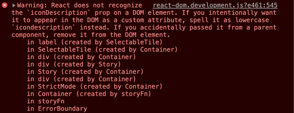
Screen Shot 2020-01-08 at 10 34 17 AM
Seems like if folks are still using iconDescription the prop will be spread onto ...other and cause the warning?

Copy link
Contributor

Choose a reason for hiding this comment

The reason will be displayed to describe this comment to others. Learn more.

Though this has been merged already - You are right. I don't see it's a problem, though, given it's a React warning that doesn't prevent user applications from working, and they can simply remove iconDescription to get rid of the warning.

iconDescription,
className,
handleClick, // eslint-disable-line
handleKeyDown, // eslint-disable-line
// eslint-disable-next-line no-unused-vars
onChange,
light,
...other
Expand All @@ -326,7 +337,7 @@ export class SelectableTile extends Component {
id={id}
className={`${prefix}--tile-input`}
value={value}
onChange={onChange}
onChange={this.handleOnChange}
type="checkbox"
name={name}
title={title}
Expand All @@ -340,9 +351,7 @@ export class SelectableTile extends Component {
onClick={this.handleClick}
onKeyDown={this.handleKeyDown}>
<span className={`${prefix}--tile__checkmark`}>
<CheckmarkFilled aria-label={iconDescription}>
{iconDescription && <title>{iconDescription}</title>}
</CheckmarkFilled>
<CheckmarkFilled />
</span>
<span className={`${prefix}--tile-content`}>{children}</span>
</label>
Expand Down