Table #61
Comments
|
I think it’s worth supporting a "sortable tables" pattern, whereby users can click on a column heading to re-sort the table by that column (and click again to reverse). This is useful for enabling people to quickly discover the maximum and minimum values. This should also be discoverable, which can be achieved by making the the column header blue, with icons for sorted ascending, descending or not sorted. Here’s an example from a live service: https://www.ethnicity-facts-figures.service.gov.uk/crime-justice-and-the-law/courts-sentencing-and-tribunals/sentences-and-custody/latest |
|
Thanks Frankie, sortable tables is definitely something services have needed in the past. The GOV.UK Performance site has some examples of sortable tables @LJWatson has also worked on accessible sortable tables: |
|
@timpaul nice, I should get around to publishing the code we use too. We had to support the additional complexity of tables with rowgroups (multiple One key thing we found is that whilst some patterns only contain an arrow icon on the currently-sorted column, this can lead to user confusion as the other column headers can be mis-interpreted as links (to pages explaining the column heading), and is also less discoverable. Adding a double-arrow (one pointing up, other other pointing down) helps avoid this. |
|
Everyone seems to have their own understanding of when to use a table. A clear definition of tabular data would be great. |
|
I've made an initial release of our sortable table code here: https://github.com/frankieroberto/sortable-table – I've not done a review of how it compares with @LJWatson's code yet, but I expect it's fairly similar. |
Our tables are not optimised for small screens. They do not show all data, instead information flows out of view. We can make changes to the UI to make it respond and show the data in a stack but when we do this the context of the data is lost unless we do more work. Also for non-sighted users or for people using screen-readers table context is lost, as the ‘headings’ for data is at the top of a table. If the table is long or complex, referring back to these headers is a difficult task. In the WRLS team we have done some UI work to optimise tables for mobile and small screens. We present the ‘stacked’ single column data with associated labels so that context is always present. On bigger screens we hide these labels but they are still then available for screen-readers. Here is a link to a bug we have around tables not working for small screens And a summery of related notes taken from a visit to the Digital Accessibility Centre in Neath where we showed the WRLS project to users with specific access needs and we saw and heard from them that our table data was not meeting a good standard of accessibility. https://drive.google.com/open?id=1mAxzHq4Sz2YWBYPoblMnsPCls7uRFWJ9HoiqsAFK5I4 To achieve these flexible tables we made them using and styled them like tables. Also we did a bit of work to make sure that these tables work well when screenreaders are using them. Examples of the flexible table UI are here: |
|
I think it'd be worth adding an example of a table with html inside the cells. Took me experimenting with swapping the nunjucks {{ govukTable({
caption: "Text and Links",
firstCellIsHeader: true,
head: [
{
text: "Text"
},
{
text: "Link"
}
],
rows: [
[
{
text: "Example text"
},
{
html: "<a href='#'>Example link</a>"
}
]
]
}) }} |
|
Currently tables expand automatically to full width. This creates problems for screen magnifier users (for example using Zoomtext). Where there is a significant amount of space between columns it can be difficult to keep track of relationships between the data cell and the row header. For example in the design system it shows: |

|
Locking columns into view (or sticky columns) are not advisable as users using screen magnifiers can be blocked from viewing data columns by the locked column. This can be a common problem in large spreadsheets. I haven't seen too many tables online with locked or sticky columns, but it is definitely something to be aware of. Freezing rows (sticky header rows) are ok to use, but are not exempt from this problem. |
|
If a column has no data in it then it should be removed. This helps with accessibility as it reduces the need for (further) horizontal scrolling if a user is using a screen magnifier. |
|
Australian Design System chat regarding tables... https://community.digital.gov.au/t/table/92/20 |
|
I think there's definitely a case for 'sticky' header columns, as well as header rows (which are more common), especially for very large tables and specialist users. That said, they're not yet easy to implement without some complex javascript. For an example of where this does work, see Google Sheets, which has this as an option. |
|
I just added a comment to an accessibility checklist, but I think it belongs here:
|
|
One gap with the table component is how they work on smaller screens. At the moment the table's width breaks the layout like this:
There are a number of options to consider such as: (1) In the case of two or three column tables we could decide to use the “Check your answers” pattern that actually uses a (2) To give the table container its own horizontal scroll bar with appropriate signifiers that this behaviour exists such as a fade out effect on the side. (3) Using CSS to change the layout on small screens so that table headings are repeated for every row as described in Responsive table layouts And for each of these options there maybe various usability and accessibility implications. I'm not sure there is one size fits all but at the moment, a pretty major component of the Design System is lacking an opinion for a fairly common scenario. |

|
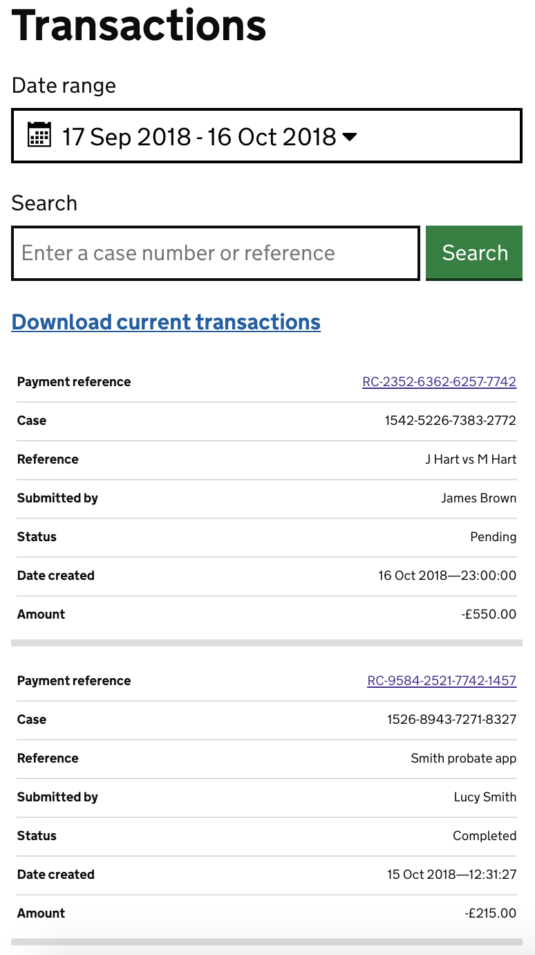
@adamsilver Have a look at https://responsive-tables.herokuapp.com/tables/transactions for a way of doing 3. This was done by @Fenwick17 in a service with a 4 or 5 column table of financial data. Code is available at https://github.com/Fenwick17/responsive-tables |
|
@stevenaproctor that's really helpful—what usability/accessibility testing has it had so far? (I see that there are some ticks against some screen readers.) I notice that the inline headers are hidden using aria. One situation here which might be worth exploring is sighted screen reader users. In this case, the user sees a header for every row but doesn't hear it which might be disorientating. |
|
@adamsilver I think there are visuallyhidden |
|
An example with horizontal scrolling on the table for smaller screens: |
|
@adamsilver When you navigate to a cell such as '1 January 2017' It will be read out as 'Date, 1st January 2017'. |
|
Hi @stevenaproctor thanks for the responsive tables link above looks ace, images are an example of how myself and @adamsilver have mocked this up on a project we are working on, something very similar and for financial data where a user is looking for a particular item in a table this works well labelling every column header next to the row data. I'll take a look at using the code from above. But as previously said for users looking to compare data across a table another option might be better. |

This modifies the width of columns to allow all the content to
display on mobile viewport.

There's been some interesting discussion in
alphagov/govuk-design-system-backlog#61
about responsive tables so hopefully we'll soon be able to have
a better solution for making tables responsive.
This modifies the width of columns to allow all the content to
display on mobile viewport.

There's been some interesting discussion in
alphagov/govuk-design-system-backlog#61
about responsive tables so hopefully we'll soon be able to have
a better solution for making tables responsive.
This modifies the width of columns to allow all the content to
display on mobile viewport.

There's been some interesting discussion in
alphagov/govuk-design-system-backlog#61
about responsive tables so hopefully we'll soon be able to have
a better solution for making tables responsive.
|
Article with some useful information and examples https://www.smashingmagazine.com/2019/01/table-design-patterns-web/#top |
|
The table component doesn't handle really long strings of text with no spaces very well. @colinrotherham raised a pr for the summary list component two weeks ago to address this on that component - I wonder if a similar thing would be suitable here too. |

|
A minor need we've had - to be able to turn off the last bottom border. This is because the table sits within an accordion, and the accordion sections already have borders between each section. Example: Our solution was this css: .app-table__in-accordion tr:last-child td {
border-bottom: none;
} |

|
Does anyone have insight on why the first column values are styled as column headers and made bold on the Gov design system? https://design-system.service.gov.uk/components/table/default/index.html The NHS design system table does not make these bold and are styled the same as the second column: https://service-manual.nhs.uk/design-example/components/table/default?fullpage=undefined&blankpage=undefined |
|
@samantharsaw All of the examples in our documentation are two-dimensional tables, where the 'heading' for a cell is a combination of both the column and row header. To pull from the table you linked: The "Amount" for the "First 6 weeks" is "£109.80 per week". Both row and column headers should be marked up in certain ways so that assistive technologies understand them. If either "Amount" or "First 6 weeks" were omitted, a screen reader user may not understand what the context of "£109.80 per week" is or what it means. We show both column and row headers in bold to make this clearer to sighted users too. I'm interested if the NHS design system folks have any specific reason for not using row headers, as it seems like they should exist—especially on their other example, where it is possible for a screen reader user to hear that they should give "200mg to 400mg" of ibuprofen, without necessarily hearing what age group that applies to! |
Even though it's not part of the design system some services at DfE make
use of table footers. There's one included a screenshot on the design
system's tables issue.

As it's really straightforward we may as well support it in the table
component too.

[0] alphagov/govuk-design-system-backlog#61 (comment)
|
Has anyone worked on a table with two headers? All the table examples on the design system have a one header row. However I've been looking at tables with a row header and a column header and found an example on the W3 org site: https://www.w3.org/WAI/tutorials/tables/two-headers/. Has anyone worked on creating an accessible example of a table like this using the kit? |
|
Hi there. I'm interested in following developments for adjusting the table UI according to breakpoints. I saw above in comments troubles on smaller screens. At this Asset Management company I work for, the UX team is investigating moving from columns(true table) to list view for the XS and S bootstrap breakpoint widths. Has the GOV UK design system had movement on a UI adjustment for the XS and S breakpoints ? I'd love to see the result. This is what we are playing with so far: |

|
Hi @RoxanneGux, Determining whether a table needs to be responsive, and the most appropriate method of doing so, is largely dependent on the actual contents of the table. For example:
As it's so contextual, with no obvious one-size-fits-all answer, we don't provide any particular code or guidance for making tables responsive. It's really up to what works best for the data. Hope that helps! |
|
Thank you @querkmachine. Thinking about whether the columns need to remain column-comparable based on their contents and the table's purpose is super helpful. In my example, I might be able to get away with turning the table into cards based on this argument. And thank you for the examples. One question, as I would like to show these examples to the team, is why this one "the import requirements for seeds" is not turning to cards when I resize. It looks like this maintaining horizontal scrolling : Thank you! |

|
@RoxanneGux Ah sorry, I was giving the links as examples of tables being used to display different types of data. As far as I'm aware, neither of the last two solutions I suggested have actually been implemented on GOV.UK. |
|
There's lots of discussion on designing tables for small screens in this thread, so I wonder if the guidance should be updated to bring all of that in. It seems like it would be useful for people. (Note: this hasn't been prioritised by the community currently, only leaving a comment for our future selves.) |
|
Has anyone come across difficulties with understanding tables due to the missing borders between columns? Some examples of problems with tables that probably only exist because of the table design:
I collected examples of bad tables that show some of these things compared to a (not pretty) design that shows all main table features. (Sorry, that document is only visible to GDS people.) |
|
With regard to table column labels that sit above the top table line. These are currently text-aligned top. In the scenario that some of these column labels are quite long and so need to be two- or three-deck to fit, it would be much better if all were text-aligned bottom. This would benefit in two ways.
I’d be interest to know exactly what research has been performed on these. My testing (in another company setting) resulted in general but overwhelming feedback as being easier to locate and more related to the to table when there was a mix of varying table label lengths. The attached is my table label alignment proposal for consideration.
|

|
Hi Terry, |
|
@Terry-Price are you able to help @atinGovUK with their query?
|
Use this issue to discuss this component in the GOV.UK Design System.
The text was updated successfully, but these errors were encountered: