-
Notifications
You must be signed in to change notification settings - Fork 4.3k
New issue
Have a question about this project? Sign up for a free GitHub account to open an issue and contact its maintainers and the community.
By clicking “Sign up for GitHub”, you agree to our terms of service and privacy statement. We’ll occasionally send you account related emails.
Already on GitHub? Sign in to your account
Navigation menu block: Reuse existing design patterns for menu item controls #16974
Comments
|
Thanks for breaking this out, @sarahmonster! I really dig the explorations. Right off the bat, I'm immediately pulled to the Block Toolbar option. The familiar pattern of blocks within blocks just works for me here. I also imagine it would be helpful to see the dotted borders of the parent/nested blocks as worked on here: #14961
This sounds like a great opportunity to figure out within the context of the Nav block and extend to the Columns block.
Great point. If several of the nav items are 4 letters long, this could be lots of small blocks. Do we use flexbox to equally spread them regardless of the length of word? Should we allow the unselected inner block to size down to the word, while the selected inner block expands to allow editing? I don't like that latter option, but raised it anyways.
I'd say, "yes". I figure you're asking this because of the options like
Probably not if they work well within the ellipses dropdown. |
|
Thanks for presenting the three options.
I think we'll get to a point where we can have child blocks for each gallery item, which will bring a few consistent interactions for free — like drag and drop to reorder, individual control over an image link, etc. I'll follow up with some mockups of my own for the third option (block toolbar). |
|
The main reasons for following standard block patterns are both familiarity to users but also that it would force us to solve design problems more systematically. If narrow nested contexts are suffering interaction wise, we can solve that generally and improve the experience of not just our core blocks but any 3rd party blocks. This can be reflected already in some general concerns:
One idea I have for simplifying toolbar handling in nested contexts is to optionally allow an inner block container to say that it wants to absorb the toolbar of all the children. In those cases, selecting a child block within that area would change the toolbar content but it would be positioned at the level of the parent. This could be really useful for the navigation menu block, as selecting different items would remain coherent while offering specific tools for the right contexts. cc @jasmussen Navigation BlockThe main block is the Navigation block. It defines the menu area and contains all the menu items. This is already the case in all previous presentations, so let's dive into some of the details. A crucial aspect here is that I think we need to make the block navigator front and center as a viable interaction pattern for this block, as with complicated nested structures it might offer the best and most clear organization. Particularly relevant would be implementing #11408. The other aspect is that this block needs to be dynamic. (#16810.) To discuss:
Link (Child Block)The only child block allowed under Navigation is the Link block (or Menu Item). It is inserted automatically when pressing the One thing I'm interested here is evaluating if a Link block can be something we make available in general to be inserted anywhere. The main aspect is that it keeps a tight relationship with a site property (unless link is custom), so that updates to a site domain, permalink structure, etc, would naturally work. The main interactions here would be adding a new item (expose existing pages, posts, categories, etc) and editing an existing one. The text label should be directly editable always. The relationship to an existing site property (a page, a post, a category view, etc) should be made extremely clear to the user as well, either in the toolbar, the inspector, or both. To discuss:
SubmenusNested menus are going to be tricky because we'll have a permanent tension between faithfully representing the front-end and optimizing for managing complex menu structures. This will be generally at odds. That's why I think leveraging the block navigator is going to be crucial for managing this elegantly and efficiently. That said, we should still find ways to present things directly on the canvas the best way we can. Selecting an item that has children, could automatically show them, for example, or we could have a toggle. |
This is definitely tricky to get right, and I hope we can receive a lot of divergent explorations on what this might look like. But I do strongly agree that if we can find a consistent pattern for this, it will benefit every single block. One ingredient for starters, could be a solid solution to #16681. Another ingredient is to reduce the surface area of the "mover" component. Right now it includes a draggable handle, which has been necessary in the current design. But if there was a way we could improve how drag and drop worked to not need an explicit handle like this, it would simplify the component a fair bit. I'm unsure if it could work, but if it could, here are some quick and dirty mockups along that vein. Vertical: Horizontal variations: |
|
I am really keen on using child blocks for this and love to simplified explorations. I will also add I think using existing patterns is absolutely the right option. The idea the toolbar changes I think has the potential for other instances moving on if this happens for navigation. Just to add a point, contextually adapting could open up a lot of potentials and know it's been floated around a fair bit recently as an idea. I really like it as a concept, moving forward.
For me, a block transformation seems sensible there.
I am torn on this one. I can see a stress case for repeat use but the pattern of reusable blocks is a strong one to lean on.
I really think the minimum is:
I feel we can lean on link searching for this.
Yes! I really like the idea we offer that.
Yes, so much! I sort of really like the horizontal variation for movement, this could help with layouts. |
|
Thanks for sharing those additional mockups, @mtias! Very helpful!
For me, I think it's a block property because Transforms seem to transform one block into another somewhat different block. Changing layout doesn't warrant a transform. For example, take a look at the Posts block.
I'd agree that the reusable block paradigm would be the good route here. Here's an example of how the current reusable pattern works when trying to create a nav within it.
I like this idea. Let's make the inner blocks as simple as possible by moving what we can to the parent block.
I think a couple of these might work well in a Nav block placeholder/setup screen. When adding that block to the page, there could be a couple options; 1) Select existing nav to convert to this block, 2) Use all top level pages, 3) Start anew with a blank nav.
I agree. A toggle in the sidebar might do well.
Yes. I remember the original did promote "Search" as the primary choice, but there was thought around a "Browse" tab as well. I don't remember if this was mocked up or not though. Presenting top-level pages in addition to search might be a good exploration.
Very true. I'd like to follow a similar pattern to how we do the Category block today with the "dropdown" option toggled "on." Basically you can click to open the dropdown, but clicking any of the links in the dropdown won't do anything. Example below. |
|
In regards to my comment above...
Here's an example of what I was thinking. It's not the best wording, but something visual to think through. |
|
Since there's a lot of different pieces to unpack here and more exploration needed on different parts of the problem, let's aim for moving some of the conversations to the relevant issues:
I'd encourage us to think of this question, not from a technical perspective, but from a user's perspective. As a user, is a horizontal menu the same as a vertical menu, or are they different? I'm not entirely certain of the answer here, but my hunch would be that they're the same—they're just styled differently.
The original proposal included a mock up of the browse interface, but suggested search as a primary action:
I'd love to see us move away from the named menu paradigm. The majority of users aren't likely to need to insert the same menu in multiple places—you add a menu to your site header, you're good to go. Using reusable blocks seems sensible, especially when this behaviour is unlikely to be the primary use case. I've updated the mockup here to include the child/parent/sibling dotted borders introduced recently, so we can see how those would impact the visual styling here: |
|
@sarahmonster can we maybe keep the conversation in one place? I'm not sure splitting is going to help here as it's a little confusing. I can see the reason to move out customization, but the others not so sure. Happy to be wrong though if there's a reason I am not seeing. |
|
I am going to try and summarise some of the good conversations so far (excuse Frankendesigns as I copy and paste from all the things). Props to @mtias and @melchoyce for the fuel for this summary. This seems to come down to a few things need agreement and final designs for based on conversations. The sections we are talking about:
If we take the following work by @mtias as a starting point let's see what needs clarifying from there: Some points people seem to agree on:
This seems to be explored in the placeholder here by @melchoyce: I personally think having at the start is fair. I am not linking this as final design as much as trying to summarise. Some points not agreed on yet and need visually exploring (notes from Matias' comment):
Designs that need to be confirmed/mocked
I left the discussion of customisation for #16830 What am I missing? If there are explorations I should have linked in, apologies there but trying to summarise so we can move forward all on same page. |
|
@draganescu has some great thoughts on modes worth adding into this here: #16821 (comment) |
|
@mtias mentioned this so thought I would briefly explore it (this is a sketch):
I guess it depends on what we decide on as defaults for this block. |
|
I sketched a little what taking the existing link interface and adding in top level pages + easily adding any could look like. For this test, the second one would be by default, if you chose to close it you could too. There is nothing new here, it brings in though sections to make processing so much easier. |
|
Awesome summary, Tammie. I'm super excited for this block to land, almost to a point where I feel like we should think of what the minimal version is, launch that, and look at how to iterate features back into it as they become necessary. Your summary does a great job in enabling such a thought experiement.
In the name of "what is the least we have to do at start", it may even be worth flipping that question on its head: why should we keep the feature? What use cases does it currently address that, as you suggest, might be better solved differently in the block editor?
Are you referring to this one? So here's a thought that builds on your thought here, but also past iterations I've seen: all of it happens in the popover you get when you press "Add New". Here's how you add new logos to the incoming Social Links block: Now depending on where we want to take it, we might go so far as to show every page, post and category directly in there as items you can insert. Something like this: ☝️ very quick and dirty. But it would show everything. You'd only ever have to open a familiar looking library interface, and we'd basically be taking the "everything is a block" to the next level.
I don't think we need these for a V1, truly honestly. You can delete a menu item, reinsert it, to sort. I feel this is especially true as there are numerous tickets for allowing you to rearrange blocks separately, and addressing these will benefit the Navigation Menu block. For Social Links, you won't be able to reorder initially, but also with this one, a benefit will be had when horizontal movers appear. For when the time comes to explore that, I love this mockup that @iamthomasbishop explored for horizontal movers: Re-sorting navigation menu items will happen. But a V1 without it, is better than no navigation block. Then we can raise the bar for each release. Or, we can just add left/right buttons in the block toolbar as Matías suggested.
Oh interesting. Just reading this, I looove the idea of this as a style variant. Think of it, if you can do it in CSS only (which you can,
By deciding these are variations, they are trivial to implement too, that's good. We can start with just the first two variants.
I can't quite picture how much interactivity this should have. Is it just a copy of the block traversal tool that sits in the top toolbar? Or is there additional interactivity? I'm picturing as Matías suggests it to be crucial and needed front and center, that this may be where we might want to handle the main "building" of the menu when an item has subpages. Should it not then happen in a modal dialog which sits still on the screen, letting you work with a lot of space available? Honestly the interface could be very much inspired by this plugin you tried here, Tammie: Just picture those as menu items, inside a dialog instead. |
|
Following a discussion in Slack today (Note: You may need a Slack account to log in.), we've made some progress in determining next steps here and action items, although we didn't have time to discuss everything. Here are my notes! Constraints to keep in mindFrom @mtias:
What we need from designFrom @mtias:
Horizontal move controlsMockups for this already exist here: #17093. It seems from discussion none of the options presented are good to work from. We don't necessarily want to use the existing move controls, and should try instead introducing a completely new pattern for horizontal move controls, rather than using the existing move controls. Solution: We agreed to work from this mockup: and iterate directly in code. If that doesn't work and we need to go back to the drawing board, here are some suggestions that were given:
I’ve closed the issue exploring these to reflect this new course of action. Navigator modeThis is basically two things:
Action items:
Adding new menu items
See #17116, which is currently blocked due to unclear requirements. If we’d like more explorations here, we’ll need to clarify what we’re looking for, but it looks like we may not need to explore further. @karmatosed and @matias shared some mockups on here that may be more in line with what we’re looking for than our original designs. Can we move forward with these designs and iterate in development? Next stepsBeyond the action items identified above, is there anything else that we need from design at this stage? |
|
Noting that I created #17267 to track improvements to make the child block UI less clunky. |
|
With the recent work on navigation block, this issue is slightly out of sync. There was an agreement in today's design traige session to close this. |
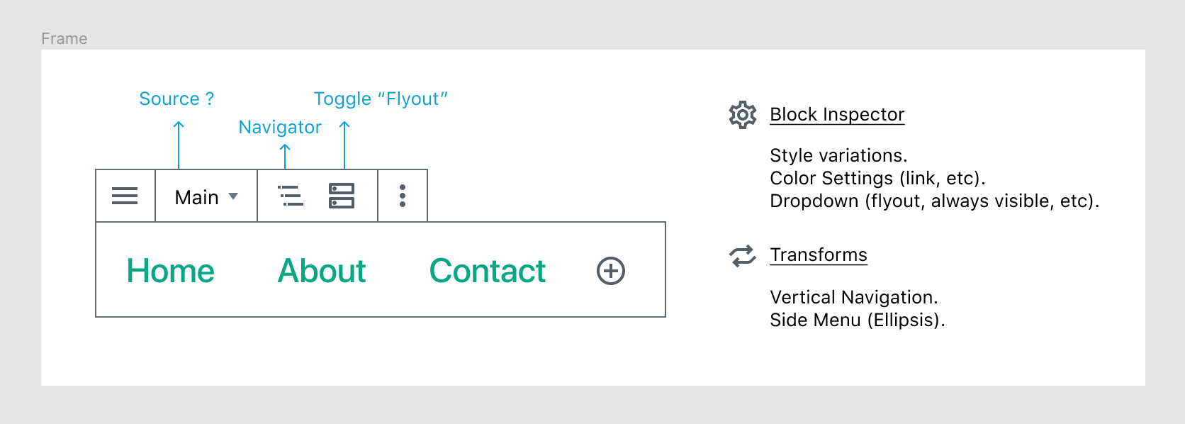


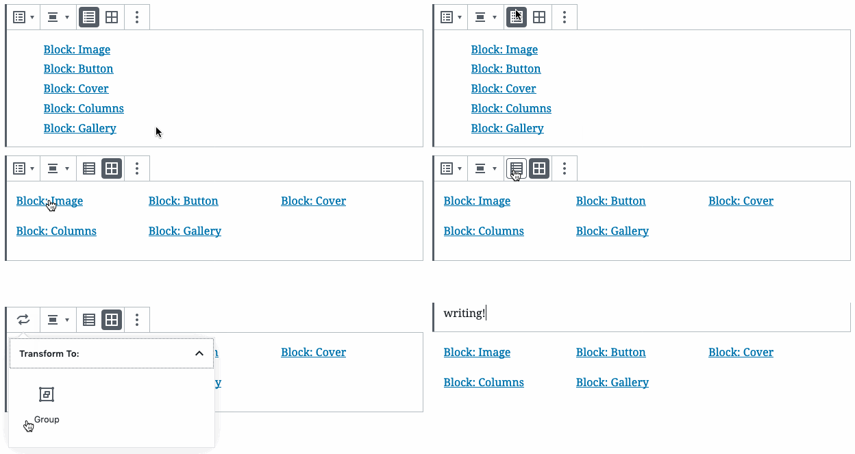


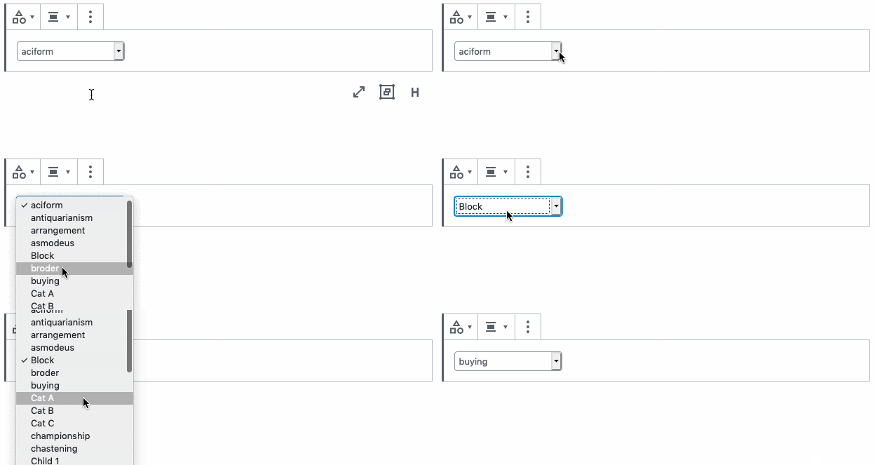
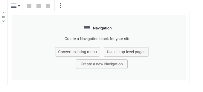
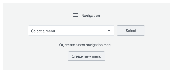

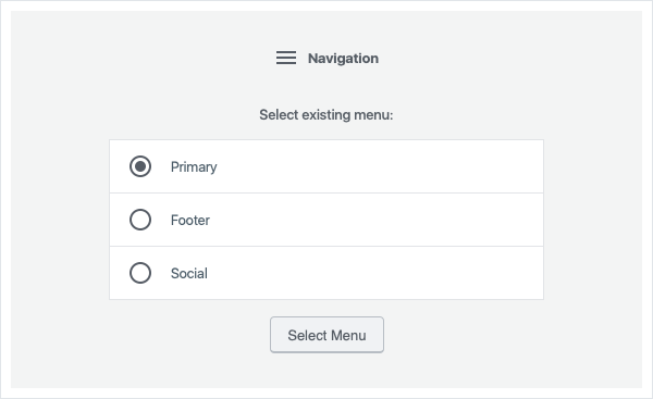


From #16821:
Exploring the problem
Problem:
Introducing a new pattern just for the navigation menu item block controls forces users to learn a new pattern that isn't reusable elsewhere, potentially leading to confusion.
How we determine if the solution has succeeded:
@mtias @mapk @karmatosed How did you want to select the best solution here? Ideas:
Potential roadblocks:
Whatever we land on needs to allow for vertical and horizontal rearranging in a relatively small space. (This will be explored in more depth next, but it's worth keeping in mind here since it will impact things here.)
We also don't want to lose all the work we did in the accessibility walkthroughs. How do we allow keyboard and screen reader users to easily move elements without drag-and-drop?
Original controls
A refresher on the original designs we landed on. These tested well with users but represent a new pattern for users to learn, since they use custom controls.
Gallery style controls
Following the inner-block pattern used here by the gallery block allows us to keep things a bit more visually simple whilst still avoiding introduction of a new pattern.
This allows us to also extend these changes to the gallery block, should galleries need more advanced controls. We can use a custom ellipsis dropdown for advanced move controls, and move the simple (back/forward) move controls directly into the block controls, keeping things more streamlined.
Technically, the gallery isn't a good example to copy—we aren't providing controls for a block, but rather an item inside a block. But this is a technical distinction. Do users know or care about this distinction? Is it important to their understanding and mental model of how the system works?
The Block Toolbar
This was modelled after the columns block, which uses blocks inside blocks. The columns block is sort of notoriously hard to use (I keep getting the + icon jumping all around and all over the place whilst trying to use it.) I'm a bit concerned this may become extremely difficult to work with when we'll have a whole lot of pretty small blocks closely aligned.
Can we add anything to the ellipsis menu if we follow this approach? Do we need an extra flyout to represent advanced move controls? Do we need to drop advanced move controls, or move them to a sidebar, neither of which feels like a super accessible solution.
The text was updated successfully, but these errors were encountered: