Skip to content
New issue

Have a question about this project? Sign up for a free GitHub account to open an issue and contact its maintainers and the community.

By clicking “Sign up for GitHub”, you agree to our terms of service and privacy statement. We’ll occasionally send you account related emails.

Already on GitHub? Sign in to your account

Change thumbnail media fit to "fill" by default #2044

Merged
merged 2 commits into from
Nov 17, 2022
Merged
Show file tree
Hide file tree
Changes from all commits
Commits
File filter

Filter by extension

Filter by extension

Conversations
Failed to load comments.
Loading
Jump to
Jump to file
Failed to load files.
Loading
Diff view
Diff view
14 changes: 3 additions & 11 deletions assets/section-main-product.css
Original file line number Diff line number Diff line change
Expand Up @@ -1206,18 +1206,10 @@ a.product__text {
}

.thumbnail img {
pointer-events: none;
}

.thumbnail--narrow img {
height: 100%;
width: auto;
max-width: 100%;
}

.thumbnail--wide img {
height: auto;
object-fit: cover;
width: 100%;
height: 100%;
pointer-events: none;
}

.thumbnail__badge .icon {
Expand Down
71 changes: 31 additions & 40 deletions snippets/product-media-gallery.liquid
Original file line number Diff line number Diff line change
Expand Up @@ -154,6 +154,13 @@
id="Slider-Thumbnails-{{ section.id }}{{ id_append }}"
class="thumbnail-list list-unstyled slider slider--mobile{% if section.settings.gallery_layout == 'thumbnail_slider' %} slider--tablet-up{% endif %}"
>
{%- capture sizes -%}
(min-width: {{ settings.page_width }}px) calc(({{ settings.page_width | minus: 100 | times: media_width | round }} - 4rem) / 4),
(min-width: 990px) calc(({{ media_width | times: 100 }}vw - 4rem) / 4),
(min-width: 750px) calc((100vw - 15rem) / 8),
calc((100vw - 8rem) / 3)
Copy link
Contributor

Choose a reason for hiding this comment

The reason will be displayed to describe this comment to others. Learn more.

Any reason why we went from calc((100vw - 14rem) / 3) to calc((100vw - 8rem) / 3)

Copy link
Contributor Author

Choose a reason for hiding this comment

The reason will be displayed to describe this comment to others. Learn more.

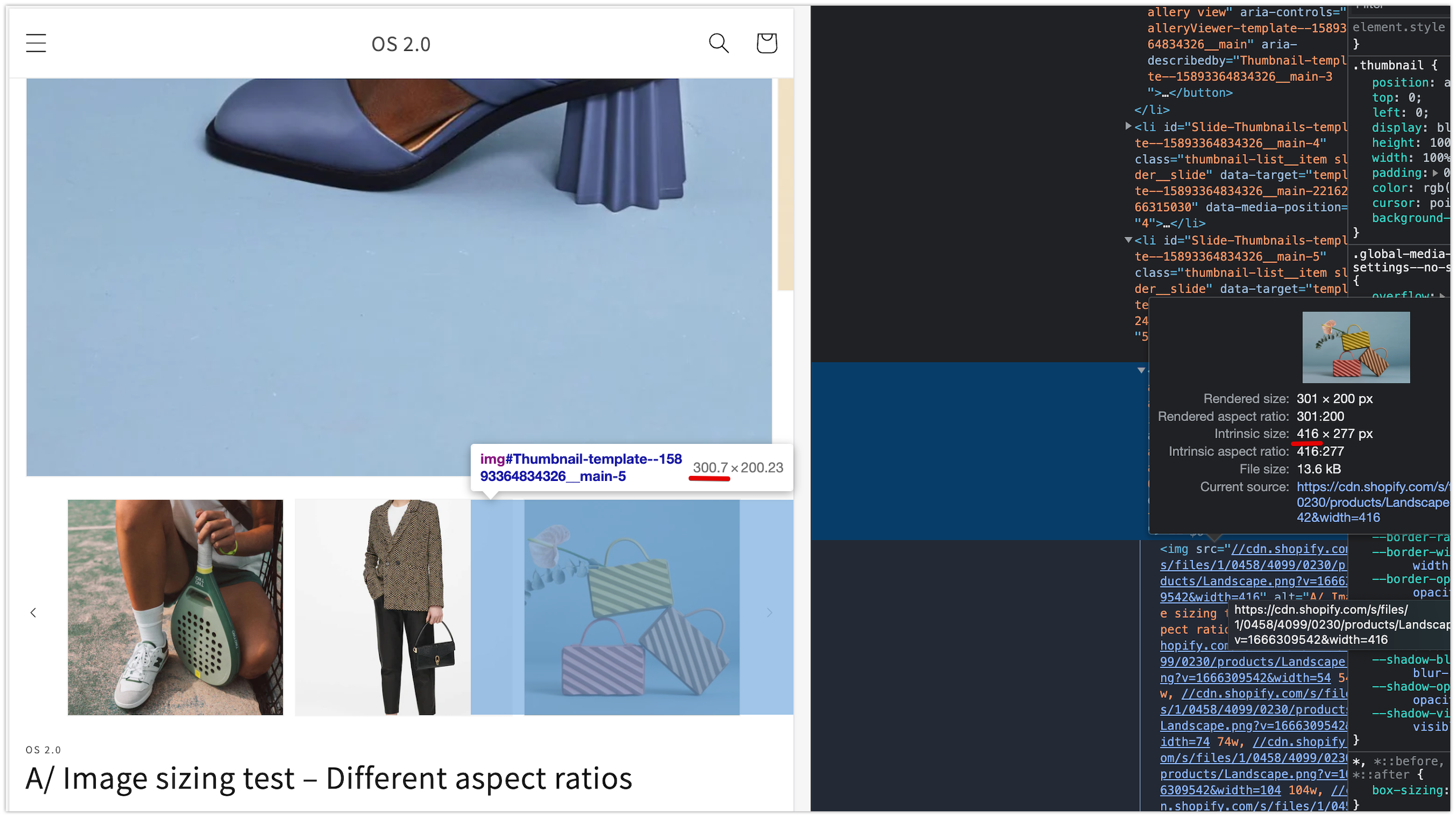
I will say the crux of this PR is the image size stuff and there could be cases I'm missing, but like I mentioned about the srcset, with the cover fit in place, I've kind of been rounding up to avoid having to create an unnecessarily complex sets of conditionals to account for possible setting/screen combination.

For this one specifically, I know there was a specific mobile case where a landscape image was rendering very blurry with the original size. I believe I sort of combined the existing mobile size logic here with the "other" (un-updated) instance in the loop below which was originally calc((100vw - 8rem) / 5). The 5 seemed like a mistake because mobile only shows 3 thumbs, but I otherwise felt this had a better result than calc((100vw - 14rem) / 3)

I don't know, maybe something like 11rem would be better than 8 but I'm not sure where 14 came from regardless.

Copy link
Contributor

Choose a reason for hiding this comment

The reason will be displayed to describe this comment to others. Learn more.

Gotcha 👍 thanks for the context.

{%- endcapture -%}

{%- if featured_media != null -%}
{%- liquid
capture media_index
Expand All @@ -173,32 +180,23 @@
data-target="{{ section.id }}-{{ featured_media.id }}"
data-media-position="{{ media_index }}"
>
{%- capture thumbnail_id -%}
Thumbnail-{{ section.id }}-0{{ id_append }}
{%- endcapture -%}
<button
class="thumbnail global-media-settings global-media-settings--no-shadow {% if featured_media.preview_image.aspect_ratio > 1 %}thumbnail--wide{% else %}thumbnail--narrow{% endif %}"
class="thumbnail global-media-settings global-media-settings--no-shadow"
aria-label="{%- if featured_media.media_type == 'image' -%}{{ 'products.product.media.load_image' | t: index: media_index }}{%- elsif featured_media.media_type == 'model' -%}{{ 'products.product.media.load_model' | t: index: media_index }}{%- elsif featured_media.media_type == 'video' or featured_media.media_type == 'external_video' -%}{{ 'products.product.media.load_video' | t: index: media_index }}{%- endif -%}"
aria-current="true"
aria-controls="GalleryViewer-{{ section.id }}{{ id_append }}"
aria-describedby="Thumbnail-{{ section.id }}-0{{ id_append }}"
aria-describedby="{{ thumbnail_id }}"
>
<img
id="Thumbnail-{{ section.id }}-0{{ id_append }}"
srcset="
{% if featured_media.preview_image.width >= 54 %}{{ featured_media.preview_image | image_url: width: 54 }} 54w,{% endif %}
{% if featured_media.preview_image.width >= 74 %}{{ featured_media.preview_image | image_url: width: 74 }} 74w,{% endif %}
{% if featured_media.preview_image.width >= 104 %}{{ featured_media.preview_image | image_url: width: 104 }} 104w,{% endif %}
{% if featured_media.preview_image.width >= 162 %}{{ featured_media.preview_image | image_url: width: 162 }} 162w,{% endif %}
{% if featured_media.preview_image.width >= 208 %}{{ featured_media.preview_image | image_url: width: 208 }} 208w,{% endif %}
{% if featured_media.preview_image.width >= 324 %}{{ featured_media.preview_image | image_url: width: 324 }} 324w,{% endif %}
{% if featured_media.preview_image.width >= 416 %}{{ featured_media.preview_image | image_url: width: 416 }} 416w,{% endif %},
{{ featured_media.preview_image | image_url }} {{ media.preview_image.width }}w
"
src="{{ featured_media | image_url: width: 416 }}"
sizes="(min-width: {{ settings.page_width }}px) calc(({{ settings.page_width | minus: 100 | times: media_width | round }} - 4rem) / 4), (min-width: 990px) calc(({{ media_width | times: 100 }}vw - 4rem) / 4), (min-width: 750px) calc((100vw - 15rem) / 8), calc((100vw - 14rem) / 3)"
alt="{{ featured_media.alt | escape }}"
height="208"
width="208"
loading="lazy"
>
{{ featured_media.preview_image | image_url: width: 416 | image_tag:
loading: 'lazy',
sizes: sizes,
widths: '54, 74, 104, 162, 208, 324, 416',
id: thumbnail_id,
alt: featured_media.alt | escape
}}
</button>
</li>
{%- endif -%}
Expand Down Expand Up @@ -231,8 +229,11 @@
{%- render 'icon-play' -%}
</span>
{%- endif -%}
{%- capture thumbnail_id -%}
Thumbnail-{{ section.id }}-{{ forloop.index }}{{ id_append }}
{%- endcapture -%}
<button
class="thumbnail global-media-settings global-media-settings--no-shadow {% if media.preview_image.aspect_ratio > 1 %}thumbnail--wide{% else %}thumbnail--narrow{% endif %}"
class="thumbnail global-media-settings global-media-settings--no-shadow"
aria-label="{%- if media.media_type == 'image' -%}{{ 'products.product.media.load_image' | t: index: media_index }}{%- elsif media.media_type == 'model' -%}{{ 'products.product.media.load_model' | t: index: media_index }}{%- elsif media.media_type == 'video' or media.media_type == 'external_video' -%}{{ 'products.product.media.load_video' | t: index: media_index }}{%- endif -%}"
{% if media == product.selected_or_first_available_variant.featured_media
or product.selected_or_first_available_variant.featured_media == null
Expand All @@ -241,25 +242,15 @@
aria-current="true"
{% endif %}
aria-controls="GalleryViewer-{{ section.id }}{{ id_append }}"
aria-describedby="Thumbnail-{{ section.id }}-{{ forloop.index }}{{ id_append }}"
aria-describedby="{{ thumbnail_id }}"
>
<img
id="Thumbnail-{{ section.id }}-{{ forloop.index }}{{ id_append }}"
srcset="
{% if media.preview_image.width >= 59 %}{{ media.preview_image | image_url: width: 59 }} 59w,{% endif %}
{% if media.preview_image.width >= 118 %}{{ media.preview_image | image_url: width: 118 }} 118w,{% endif %}
{% if media.preview_image.width >= 84 %}{{ media.preview_image | image_url: width: 84 }} 84w,{% endif %}
{% if media.preview_image.width >= 168 %}{{ media.preview_image | image_url: width: 168 }} 168w,{% endif %}
{% if media.preview_image.width >= 130 %}{{ media.preview_image | image_url: width: 130 }} 130w,{% endif %}
{% if media.preview_image.width >= 260 %}{{ media.preview_image | image_url: width: 260 }} 260w{% endif %}
"
src="{{ media | image_url: width: 84, height: 84 }}"
sizes="(min-width: 1200px) calc((1200px - 19.5rem) / 12), (min-width: 750px) calc((100vw - 16.5rem) / 8), calc((100vw - 8rem) / 5)"
alt="{{ media.alt | escape }}"
height="200"
width="200"
loading="lazy"
>
{{ media.preview_image | image_url: width: 416 | image_tag:
loading: 'lazy',
sizes: sizes,
widths: '54, 74, 104, 162, 208, 324, 416',
Copy link
Contributor

Choose a reason for hiding this comment

The reason will be displayed to describe this comment to others. Learn more.

Any specific reason why we change the original widths selected ? When I test quickly it seems like the wider the thumbnail is going to get is about 155px. So we shouldn't need to output anything over 300px 🤔

Copy link
Contributor Author

@kmeleta kmeleta Oct 26, 2022

Choose a reason for hiding this comment

The reason will be displayed to describe this comment to others. Learn more.

Well I mostly changed them to match the featured media thumbnail above this loop. It somewhat seemed like that instance was updated at some point and this one was forgotten about (this is why DRY is a valid consideration). I can't think of an instance where the first thumbnail should ever have different image size requirements than the subsequent ones. But maybe I'm missing something.

In any case though, with the cover media fit, images could actually render larger than the container and would appear blurry if a larger enough src isn't available.

id: thumbnail_id,
alt: media.alt | escape
}}
</button>
</li>
{%- endunless -%}
Expand Down