Cask
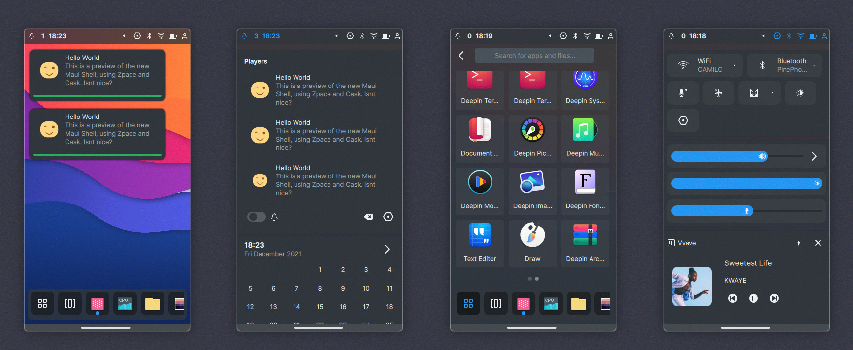
Cask is the shell layer of Maui Shell, and it encompasses the top panel, popups, cards, notifications, the dock, the launcher, etc.
The top panel spans across the width of the leading edge of the screen. It’s divided into two main sections: notifications and calendar on the left side and toggles for quick access on the right side.
The notifications popups appear on the left side of the screen.
The current selection of quick-access toggles includes network settings, volume adjustment, screen brightness adjustment, audio playback controls, and session controls.
Each section has sub-items, called PanelItem, which can have Cards associated with them: For example, the left PanelSection has two PanelItems: Notifications and Calendar, Notifications which is a PanelItem has its Card, and so does the calendar. These cards can be open individually or all the cards belonging to a section. These Cards can open by using touch gestures such as sliding down, which would open all the Cards. Or by single-clicking each PanelItem which will open its Card. You can also use a mouse wheel on desktops to open all of the Cards.
On the right PanelSection, the current PanelItems include Toggles, Sliders, Player, and Session, each with its Card.
The dock is at the bottom of the screen, listing pinned apps and opened ones. It also contains the launcher, which you can open by clicking the button or sliding up from the dock.
The dock has, by default, a window dodge feature and can be brought back by mouse hovering or by a gesture by sliding up or down to hide it.
The launcher has two pages, one where categories and another with filtered categories group apps. The idea is to add quick places sections to the main page of the launcher and other quick-access stuff.
These Cask components will adapt depending on the form factor, such as screen size and input type.
On the desktop, the top panel is discreet and clean. The panel items in the right section are collapsable. The panel items can interact with a mouse if the desktop form factor does not have a touch screen. You can open all PanelSection cards by using the mouse wheel o opening individual cards by clicking the single PanelItem.
The opened cards do not dim the screen, and cards are also auto closed when clicking outside of them or clicking again in the item.
The launcher popup card is in the center, above the dock. You can pin an app to the dock.
Maximized application windows do not cover the dock.

Here the windows take the entire screen of the tablet and do not have window decorations. There can be up to two windows per workspace, side by side or stacked. Windows can move freely using three fingers and resized using a pinch gesture with four fingers. [demo video below]
The launcher here takes the full available height and width. The panel cards, when opened, dim the screen to avoid too much visual noise.
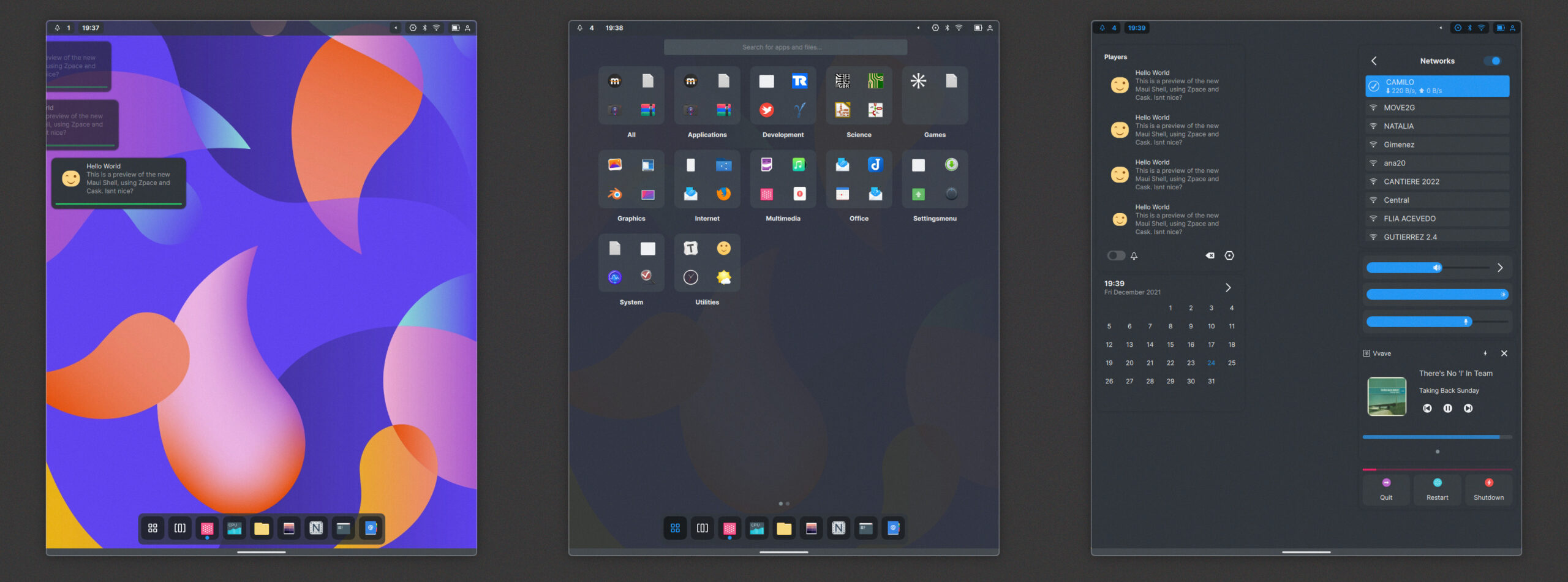
On the phone, the launcher and panel cards take all available space. If you slide from the left side of the top panel, you open the notifications and calendar, and if you slide from the right, you open the status and quick settings toggles. The notification section fills the width of the top bar, so you can slide from the middle and still open the notifications.
If the dock contains too many items, it can be scrolled or flicked using a mouse wheel or slide gesture.