회의록 9️⃣

디자인 시안에 맞는 여러 버튼을 구현해야했다.
그래서 버튼을 유심히 보니 모든 버튼은 공통된 속성을 가지고 있었다. (border-radius, color, background-color)
따라서 공통된 속성 이외의 속성을 props로 내려줘서 하나의 컴포넌트를 통해 여러 버튼을 구현하는 방식으로 접근하였다.
// constants/buttonStyle.js
export const EXTRA_LARGE_BUTTON = {
  padding: '1.9rem',
  fontSize: '1.4rem',
};

export const LARGE_BUTTON = {
  padding: '1.4rem',
  fontSize: '1.4rem',
};

export const MEDIUM_BUTTON = {
  padding: '0.9rem',
  fontSize: '1.4rem',
};

export const SMALL_BUTTON = {
  padding: '0.7rem',
  fontSize: '1.4rem',
  width: '9rem',
};

export const FOLLOW_BUTTON = {
  padding: '0.4rem',
  fontSize: '1.2rem',
};
이처럼 버튼마다 고정된 style을 지정하였다
// components/common/Button
import React from 'react';
import styled from 'styled-components';

const SButton = styled.button`
  width: ${({ buttonStyle }) =>
    buttonStyle.width ? buttonStyle.width : '100%'};
  font-size: ${({ buttonStyle }) => buttonStyle.fontSize};
  padding: ${({ buttonStyle }) => buttonStyle.padding};
  background-color: ${({ theme }) => theme.color.LIGHT_BLUE};
  color: ${({ theme }) => theme.color.WHITE};
  border-radius: ${({ theme }) => theme.borderRadius.BASE};

  &:active,
  &:hover {
    background-color: ${({ theme }) => theme.color.ACTIVE_BLUE};
  }

  &:disabled {
    cursor: default;
    background-color: ${({ theme }) => theme.color.DISABLED_BLUE};
  }
`;

function Button({ text, buttonStyle, onClick, disabled }) {
  return (
    <SButton buttonStyle={buttonStyle} disabled={disabled} onClick={onClick}>
      {text}
    </SButton>
  );
}

export default Button;
그리고 Button 컴포넌트에서 버튼마다 공통된 속성은 theme에서, 다른 속성은 props에서 받아 처리하였다.
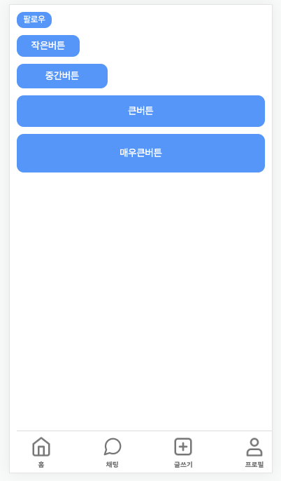
<Button text="팔로우" buttonStyle={FOLLOW_BUTTON} />
<Button text="작은버튼" buttonStyle={SMALL_BUTTON} />
<Button text="중간버튼" buttonStyle={MEDIUM_BUTTON} />
<Button text="큰버튼" buttonStyle={LARGE_BUTTON} />
<Button text="매우큰버튼" buttonStyle={EXTRA_LARGE_BUTTON} />
이처럼 호출해서 사용하면 아래와 같은 결과를 얻을 수 있다.

Header도 Button과 마찬가지로 공통된 속성과 공통되지 않은 속성들이 있었다.
Button은 전체적인 디자인이 똑같기 때문에 하나의 컴포넌트로도 충분히 해결할 수 있었지만 Header은 Header 컴포넌트 내에서도 여러 자식 컴포넌트가 존재하기 때문에 하나의 공통 컴포넌트로 구현하기 어려웠다.
때문에 아래 세가지 컴포넌트를 각각 구현하였다.
- 좌, 우가 모두 icon인 컴포넌트
- 좌는 icon, 우는 버튼인 컴포넌트
- 좌는 icon, 우는 input인 컴포넌트
- 각각의 구현 코드
-
BaseHeader (icon, icon)
import React from 'react';
import styled from 'styled-components';

const SContainer = styled.header`
  width: 100%;
  display: flex;
  justify-content: space-between;
  align-items: center;
  padding: 0.75rem 1.6rem;
  border-bottom: 1px solid ${({ theme }) => theme.color.LIGHT_GRAY};
  background-color: ${({ theme }) => theme.color.WHITE};
`;

const SButton = styled.button`
  border: none;
  flex-grow: 0;
  background-color: inherit;
  cursor: pointer;
  width: 2.2rem;
  margin: 0.5rem 0rem;
`;

const STitle = styled.p`
  text-align: center;
  font-size: 1.4rem;
`;

function BaseHeader({
  leftIcon,
  leftClick,
  rightIcon,
  rightClick,
  rightAlt,
  title,
}) {
  return (
    <SContainer>
      {leftIcon && (
        <SButton onClick={leftClick}>
          <img src={leftIcon} alt="뒤로가기" />
        </SButton>
      )}
      {title && <STitle>{title}</STitle>}
      {rightIcon ? (
        <SButton onClick={rightClick}>
          <img src={rightIcon} alt={rightAlt} />
        </SButton>
      ) : (
        <SButton />
      )}
    </SContainer>
  );
}

export default BaseHeader;
-
ConfirmHeader (icon, button)
import React from 'react';
import styled from 'styled-components';
import Button from '../Button';
import arrowIcon from '../../../assets/icon/icon-arrow-left.png';
import { SMALL_BUTTON } from '../../../constants/buttonStyle';

const SContainer = styled.header`
  width: 100%;
  display: flex;
  justify-content: space-between;
  padding: 0.825rem 1.6rem;
  border-bottom: 1px solid ${({ theme }) => theme.color.LIGHT_GRAY};
  background-color: ${({ theme }) => theme.color.WHITE};
`;

const SButton = styled.button`
  border: none;
  flex-grow: 0;
  background-color: inherit;
  cursor: pointer;
  width: 2.2rem;
`;

function ConfirmHeader({ leftClick, rightClick }) {
  return (
    <SContainer>
      <SButton onClick={leftClick}>
        <img src={arrowIcon} alt="뒤로가기" />
      </SButton>
      <Button onClick={rightClick} text="저장" buttonStyle={SMALL_BUTTON} />
    </SContainer>
  );
}

export default ConfirmHeader;
-
SearchHeader (icon, input)
import React from 'react';
import styled from 'styled-components';
import arrowIcon from '../../../assets/icon/icon-arrow-left.png';

const SContainer = styled.header`
  width: 100%;
  display: flex;
  justify-content: space-between;
  padding: 0.8rem 1.6rem;
  border-bottom: 1px solid ${({ theme }) => theme.color.LIGHT_GRAY};
  background-color: ${({ theme }) => theme.color.WHITE};
`;

const SButton = styled.button`
  cursor: pointer;
  border: none;
  flex-grow: 0;
  background-color: inherit;
  width: 2.2rem;
`;

const SearchInput = styled.input`
  flex-grow: 1;
  border: none;
  background-color: #f2f2f2;
  border-radius: ${({ theme }) => theme.borderRadius.BASE};
  margin-left: 1.5rem;
  padding: 0.775rem 1.5rem;

  &:placeholder {
    color: ${({ theme }) => theme.color.LIGHT_GRAY};
  }
`;

function SearchHeader({ leftClick }) {
  return (
    <SContainer onClick={leftClick}>
      <SButton>
        <img src={arrowIcon} alt="뒤로가기" />
      </SButton>
      <SearchInput type="text" placeholder="계정 검색" />
    </SContainer>
  );
}

export default SearchHeader;
-
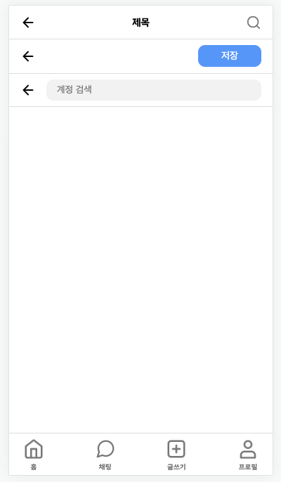
아래처럼 호출해서 사용하면 원하는 Header을 얻을 수 있게 된다.
function Home() {
  const navigate = useNavigate();
  const handleLeftClick = () => {
    navigate(-1);
  };
  return (
    <div>
      <BaseHeader
        leftIcon={arrowIcon}
        leftClick={handleLeftClick}
        rightIcon={settingIcon}
        rightClick={handleLeftClick}
        rightAlt="설정"
        title="제목"
      />
      <SearchHeader leftClick={handleLeftClick} />
      <ConfirmHeader />
      <Navigation />
    </div>
  );
}

export default Home;