Proposal: Update visuals of various buttons #3546
Comments
|
I notice there is a different Accent colour for the Dark Theme images. Is this something new coming to the platform and Accent Colour choices? The backgrounds for these controls are off white and off black. Is this a change to the ThemeResources so a white button would actually stand out? I proposed these kinds of changes here:
|
We're still evaluating any potential changes that may impact accent color variants. Stay tuned.
WinUI can't control the exact colors apps choose to use for their backgrounds, so I wouldn't read too much into the background colors in these comps.
There is no Ghost button style in WinUI. We do have AccentButtonStyle, but as I mentioned the accent color values are still being explored.
Sorry about the blurry images. The buttons have an outline with the bottom edge drawn in a darker color compared to the other edges. This is a multi-colored border element that will change with the corner radius.
They do, it's actually one of the motivations for the change. We had been failing 3:1 contrast ratio requirements in a few places. Disabled states don't have a contrast ratio requirement, so appearing fain should not pose any accessibility concerns. |
The Xaml Theme brushes set as default can be changed though. The current buttons with a semi-transparent coloured background will stand out from most backgrounds - but with dark backgrounds it can become a contrast ratio problem. These designs seem to use white as a background fill, which stands out well on an off-white background, but would be somewhat lost on a pure white background. I would suggest you consider a change to the ApplicationPageBackgroundThemeBrush resource - as well as the System Base colours.
@chigy said Ghost button styles were created for the Windows 10X shell team, and this would align to #1054 as well as Fast's various button types, Stealth, Outline, Neutral etc There is also another issue about Button types or styles #2233 things like Icon Buttons, which FluentUI has, but WinUI doesn't
So not actually using the ThemeShadow but giving the appearance of having some kind of depth. Will this design touch make its way to FluentUI buttons, as well as Fast's Fluent design provider (which Edge uses)
This is good to hear. A good balance between a good looking button, without a strong border but still meets accessibility needs. I would like to see some alignment between these and the buttons used by the Xbox team - especially as the Xbox App and GameBar are presented as integrated components within Windows. |
|
Why is WinUI always trying to match other platforms? when the exiting controls are fine |
It is rumoured that Windows is refreshing its UI - with Fluent Design at its core. FluentUI controls are cross platform, and will be used increasingly for windows apps. These proposals are just bringing WinUI designs in line with other Microsoft implementations of Fluent design - to bring consistency across Windows apps and shell, as well as Web Apps, React Native, etc. |
|
To be consistent with Google's material so that their Android devices will have a consistent design. Fluent has lost all effects like Reveal, Acrylic etc... |
|
The old Edge had the best UI... Now with the new Edge, it is plain and boring. There was a proposal that wanted to redesign Edge UI but Microsoft simply said this is the new Fluent and it looks terrible. |
I still believe Reveal and Acrylic will be back (I will be the first to complain if they don't) - but when users are moving between their Android phone, their PC or Laptop - familiarity is not a bad thing. At the moment there is FluentUI which is cross platform, and web supported. Then there is Fast which is a framework for web controls, with a Fluent design provider which is optional - and then there is WinUI which is a mix of Windows 10 MDL2, Fluent and Windows 8 Metro controls.
I liked how the legacy Edge used Acrylic for it's tab/title bar and for the sidebars. The new Edge is cross-platform, and will hopefully adopt Acrylic when WinUI 3.X supports it. |
|
I didn't buy a Windows PC to be familiar with Android. In fact, the Android UI is really bad and Microsoft shouldn't adapt their ugly design and go their own way. |
|
@mdtauk Microsoft Edge doesn't use WinUI |
|
I don't think they will put reveal effects in the new Edge when they can update WinUI to not use it instead of doing the hard-work of updating old Chromium UI |
Microsoft Edge uses Fast, which has a Fluent Design component
I worry about this too, and it was discussed in another issue. #1126 |
|
Fluent UI, in my opinion, is a fake web implementation that claims to "Fluent". It's sad to see WinUI adapting their bad design instead of the other way around. Fast is also not really Fluent. It just looks like a regular Microsoft skinned design which is not the same as real fluent. |
Different technologies will always exist, trying to use similar or identical designs for familiar controls and UI is a sensible thing to do. Not all WinUI controls have a perfect or brilliant design - and some of them look better the way FluentUI or Fast does them. The Button has many issues with contrast ratios, and looks better the way FluentUI does it. IMO |
|
@YuliKl Please don't remove the underline from hyperlinks. It may look good but it's not clear to the user. |
There are Hyperlinks and Hyperlink Buttons. I don't think Buttons need an underline, as they have padding around them, and Hover and Pressed state backgrounds |
|
@mdtauk The control may be named Button but they need an underline to be noticeable. Please don't blindly copy the trends of web apps and reduce accessibility |
Part of this redesign is to make it consistent. Web Trends are what is familiar |
|
@mdtauk No. |
|
Radio buttons look horrible. They are nothing like the old Radio buttons. This proposal makes it even worse. |
|
Speaking of the specific proposed HyperlinkButton changes, I have to say I am not really seeing "refresh Xaml UI to align with other platforms while looking familiar on Windows" in use here. The new style doesn't look familiar to the current style (using underline) at all and looking through older Windows UI elements like in the Control Panel, I notice the underline style used as well (it might not be exactly the same used in UWP XAML but they are close). Check for example the Changing the look to stay consistent with web/mobile is fine, but I'm missing the "while looking familiar on Windows" aspect here. The new Hyperlink button style really doesn't look familiar to me as a Windows 10 user. I guess this might also come down to where the new HyperlinkButton controls would be used inside Windows instead of the inline hyperlink. Take the Settings app for example: |

|
Hyperlink and Hyperlink Button are two different controls. One is designed to sit within a body of text, the other is designed to sit alongside buttons.
|


|
@mdtauk Not technically in XAML. A hyperlink is a hyperlink button inside a text control. |
<HyperlinkButton Content="www.microsoft.com" NavigateUri="http://www.microsoft.com"/><Hyperlink NavigateUri="http://www.contoso.com">Contoso Privacy Statement</Hyperlink>Two controls, and I think within a textblock the Hyperlink should maintain it's underline by default, but the Hyperlink Button has padding and margins, and hover states that distinguish it, as well as a larger hit target for tapping |
|
Being nit picky a little bit here...
|


|
What is the thinking with the Radio Button bullet changing size with the hover and pressed states?
None of the other WinUI controls exhibit this kind of visual behaviour, nor does it feature in FluentUI or Fast's controls. For what it's worth, I think the size for the Selected Pressed state in this example, is the better size for the bullet, compared to the circle containing it for all states. Edit: So looking closer at the other controls you posted in the other issue #3549 I can see the Slider and the Toggle Switch designs you are proposing also scale their circular thumb parts. I would like to ask you @YuliKl if you plan for these scaling elements to transition the size of the Thumb/Bullet on hover and pressed states - rather than a 0 duration transition which may feel jarring. |

I think the underline should be removed for both with a clean look but hovering could reveal the underline for clearness. |
Underline on hover for the Hyperlink control sounds good to me, but not for the HyperlinkButton as that would look odd alongside regular Buttons |
|
@mdtauk A regular user will not notice the difference so both should have the same behavior |
Not sure I agree, but its a fair comment to make |
|
@YuliKl Will these buttons still have optional reveal effect or did you remove that to be consistent with the web? |
You can ignore the look of MDL 2 icons for now. As mentioned on another comment, we are looking to update the icons so these visuals are not 100% final. That said, our designer educated me "In general, having a glyph with comfortable negative space is a good design practice." |
I agree with this. I just feel the Checkbox example illustrated feels uncomfortable, and off balance - as if the glyph inside is being suffocated - which could also have accessibility problems with not being clear enough. The examples from the FluentSystemIcons project, feels better, and is more easily readable. - But this is just an opinion to add to the thoughts of others.
The Left is using the Tick from the Fluent Icons checkbox, and it sitting nicely in the 20 x 20px box. |

|
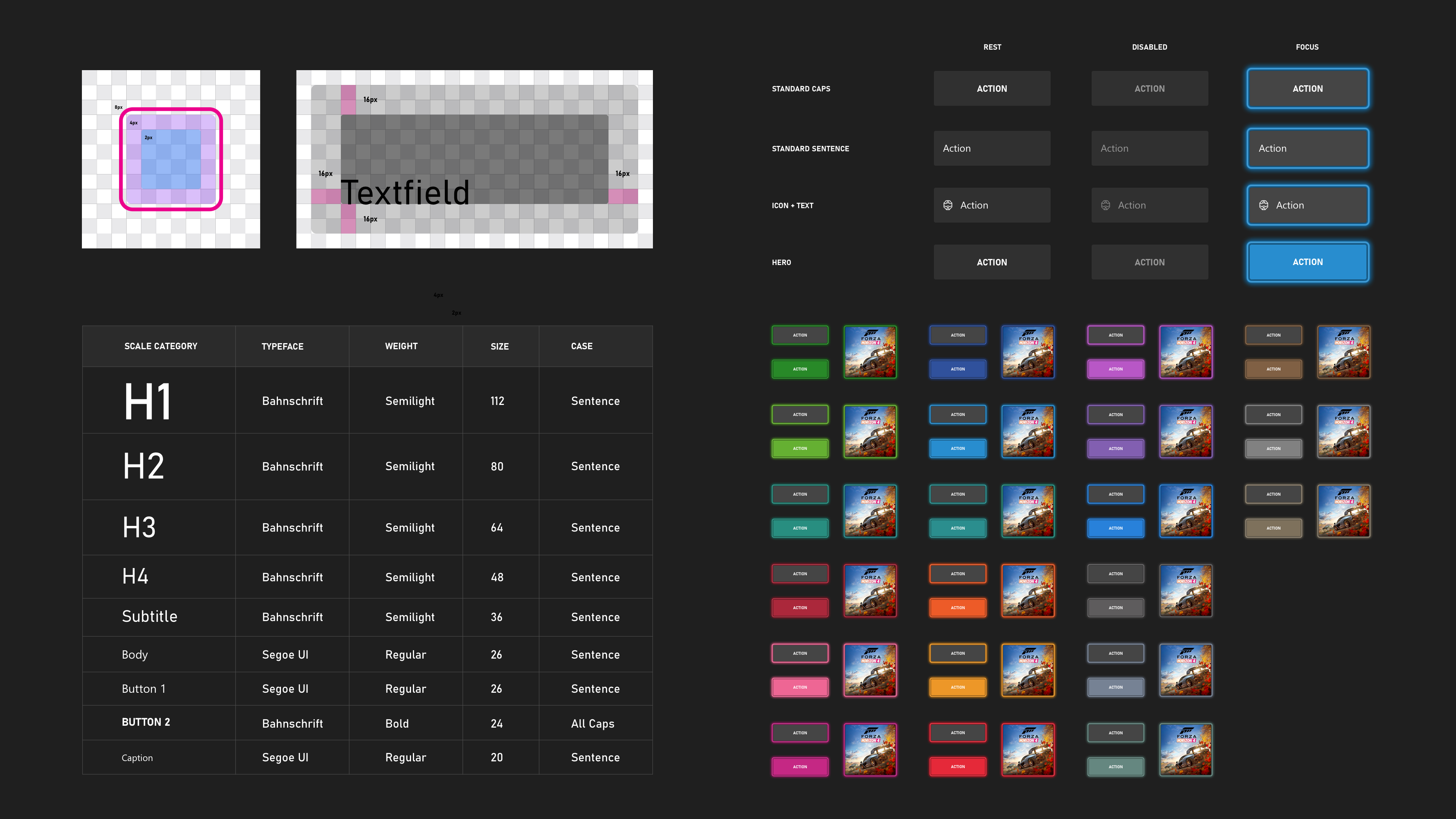
Regarding the Button hover state...
At a first glance, which of these buttons is being hovered over? I would suggest the hover state in the light mode is too subtle and becomes a usability problem. In the Dark Theme, it may be a little easier to see, but its still very subtle.
The existing buttons make this state change much more obvious
|


|
I think it would be good for Buttons to use the Semibold weight as with FluentUI - this will help the more subtle buttons stand out compared to just body text
|

|
The Split Button, and Drop Down Button's chevron looks too low and perhaps too small in the current
|

|
There was an issue posted some time back, about exploring changes to the Reveal effect. As Button is one of the primary controls to use Reveal, I think it may be time to decide on the path to take, and to put it to use with the new Button visuals.
#1126 Proposal: Improve Reveal visual |

|
There is also a related problem that has cropped up with the new Button visuals. Many controls which use a Button as a primitive, are not removing their borders. So lots of controls get faint outlines around them right now. There should probably be a built in Style to remove all visual elements for these uses - the new Ghost Control colours could be used, or border thicknesses set to 0.
|


|
The proposed button style doesn't look that clear and I think depth needs to be increased to be noticed. |
|
I would probably like a stronger border, and brighter fill for Dark Theme buttons |
|
My main complaint here is with the RadioButton pressed state, especially in dark mode. I feel there should be more contrast, maybe use white on dark mode and black on light?
|

|
@Tropix126 are you using a dark grey accent colour? I think there is an intention to alter the way the dark and light variations of the Accent Colour are generated, so the dark text contrasts over the Accent AA colours in dark mode. But a recent PR reverted the hard coded colours with the System brushes, and the variations are not stark enough to always contrast well |
|
Please use a darker colour for buttons, the current ones are not that clearly recognizable. |
These are just screenshots of earlier previews in this discussion. |
|
I agree that the light brushes should be improved. In this example I'm using SubtleFillColorSecondaryBrush: |


Update visuals of various buttons
Summary
Change the default appearance of various button controls.
Rationale
Comps showing proposed changes
Button
HyperlinkButton
DropDownButton
SplitButton
RadioButton
CheckBox
The text was updated successfully, but these errors were encountered: