We read every piece of feedback, and take your input very seriously.
To see all available qualifiers, see our documentation.
Have a question about this project? Sign up for a free GitHub account to open an issue and contact its maintainers and the community.
By clicking “Sign up for GitHub”, you agree to our terms of service and privacy statement. We’ll occasionally send you account related emails.
Already on GitHub? Sign in to your account
BottomNavigationBar 底部导航条,可以很容易地在tap之间切换和浏览顶级视图,通常在3~5个 tap 间切换。
底部导航条有文本、图标组成,通常和 Scaffold 一起使用;
先看一个例子: 目录结构
把不同tab 对应的视图分别放在各自的页面中,在 main.dart 文件中引入; main.dart 页面代码:
import 'package:flutter/material.dart';
// 页面结构调试渲染模式
import 'package:flutter/rendering.dart';
// 引入视图
import './views/smartHome/smartHome.dart';
import './views/skillCenter/skillCenter.dart';
import './views/contentRecommend/contentRecommend.dart';
import './views/userCenter/userCenter.dart';

void main() {
  // debugPaintSizeEnabled = true; // 打开页面结构调试渲染模式
  runApp(MyApp());
}

class MyApp extends StatelessWidget {
  // This widget is the root of your application.
  @override
  Widget build(BuildContext context) {
    return MaterialApp(
      title: '融合 APP',
      theme: ThemeData(
        canvasColor: Color.fromRGBO(35, 38, 66, 1.0),
        primaryColor: Color.fromRGBO(35, 38, 66, 1.0), // appBar 会采用这个值为默认颜色
      ),
      home: MyHomePage(),
    );
  }
}
class MyHomePage extends StatefulWidget {
  @override
  _MyHomePageState createState() => _MyHomePageState();
}

class _MyHomePageState extends State<MyHomePage> {
  int _selectedIndex = 0;
    // item 对应的视图
  final _widgetOptions = <Widget>[
    new SmartHome(),
    new SkillCenter(),
    new ContentRecommend(),
    new UserCenter()
  ];

  final _labelStyle = TextStyle(
      color: Colors.white30
    );

  @override
  Widget build(BuildContext context) {
    return Scaffold(
        body: Container(
          child: _widgetOptions.elementAt(_selectedIndex)
        ),
        bottomNavigationBar: Material(
          // color: Color.fromRGBO(35, 38, 66, 1.0), // 无效
          // type: MaterialType.canvas, // 无效
          child: new BottomNavigationBar(
            items: <BottomNavigationBarItem>[
              BottomNavigationBarItem(
                // 图片颜色和文本标签颜色需要单独设置
                  icon: Icon(Icons.home, color: Colors.white30), title: Text("智能家居", style:  _labelStyle)),
              BottomNavigationBarItem(
                  icon: Icon(Icons.cake, color: Colors.white30), title: Text("技能中心", style: _labelStyle)),
              BottomNavigationBarItem(
                  icon: Icon(Icons.beach_access, color: Colors.white30), title: Text("内容推荐", style: _labelStyle)),
              BottomNavigationBarItem(
                  icon: Icon(Icons.kitchen, color: Colors.white30), title: Text("我的", style: _labelStyle))
            ],
            type: BottomNavigationBarType.fixed,
            fixedColor: Colors.blue,
            currentIndex: _selectedIndex,
            onTap: _onItemTapped,
            iconSize: 26.0,
          ),
        ));
  }

  void _onItemTapped(int index) {
    setState(() {
      _selectedIndex = index;
    });
  }
}
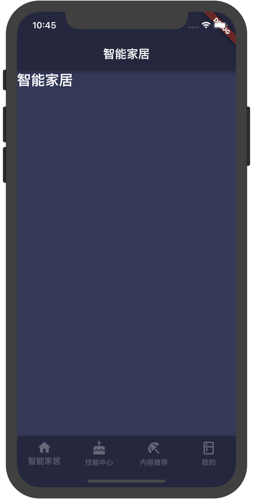
效果:
BottomNavigationBar({Key key, @required List<BottomNavigationBarItem> items, ValueChanged<int> onTap, int currentIndex: 0, BottomNavigationBarType type, Color fixedColor, double iconSize: 24.0 })
List<BottomNavigationBarItem>
BottomNavigationBarItem
BottomNavigationBarType.fixed
BottomNavigationBarType.shifting
没有显示的设置此值时,默认值根据底部 tab 的个数自动设置。底部 tab 少于四个(不包括四个)时,默认值为BottomNavigationBarType.fixed,否则默认值为BottomNavigationBarType.shifting
BottomNavigationBarType.fixed: - BottomNavigationBar的BottomNavigationBarItem具有固定的宽度,始终显示其文本标签,并且在点击时不会移位。 - 底部导航条的背景颜色默认为不透明的白色,如果设置了ThemeData.canvasColor则与ThemeData.canvasColor颜色值一致。 - BottomNavigationBarItem中设置 backgroundColor 失效。 - 选中的BottomNavigationBarItem的颜色为设置的 fixedColor 颜色,如果没有设置fixedColor属性,则与 ThemeData.primaryColor 颜色一致。
ThemeData.canvasColor
ThemeData.primaryColor
BottomNavigationBarType.shifting: - BottomNavigationBar的BottomNavigationBarItem有位置和大小动画,并在点击时标注淡入淡出。只有选定的项目显示其文本标签。 - 底部导航条的背景颜色默认为白色,可以在BottomNavigationBarItem的backgroundColor属性中设置每个 item 的背景颜色值。底部导航条的背景色与当前选中的 item 的背景色一致,ThemeData.canvasColor在底部导航条的颜色失效。
Color
double
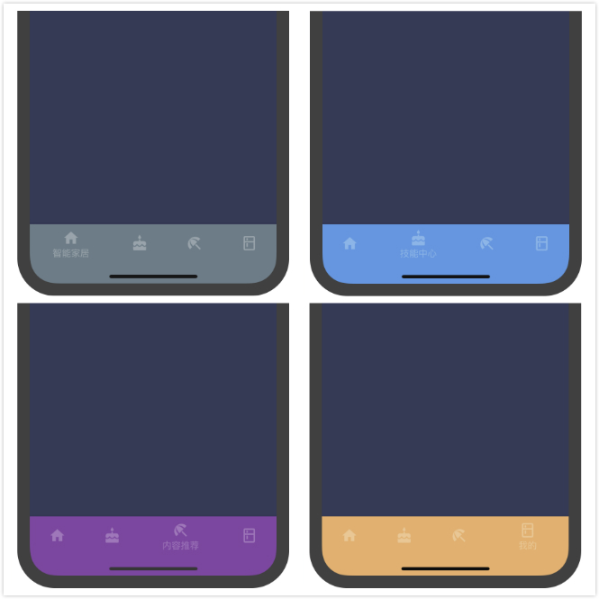
BottomNavigationBarType.shifting时代码:
import 'package:flutter/material.dart';
import 'package:flutter/rendering.dart';

import './views/smartHome/smartHome.dart';
import './views/skillCenter/skillCenter.dart';
import './views/contentRecommend/contentRecommend.dart';
import './views/userCenter/userCenter.dart';

void main() {
  // debugPaintSizeEnabled = true;
  runApp(MyApp());
}

class MyApp extends StatelessWidget {
  // This widget is the root of your application.
  @override
  Widget build(BuildContext context) {
    return MaterialApp(
      title: '融合 APP',
      theme: ThemeData(
        canvasColor: Color.fromRGBO(35, 38, 66, 1.0),
        primaryColor: Color.fromRGBO(35, 38, 66, 1.0),
      ),
      home: MyHomePage(),
    );
  }
}

class MyHomePage extends StatefulWidget {
  @override
  _MyHomePageState createState() => _MyHomePageState();
}

class _MyHomePageState extends State<MyHomePage> {
  int _selectedIndex = 0;
  final _widgetOptions = <Widget>[
    new SmartHome(),
    new SkillCenter(),
    new ContentRecommend(),
    new UserCenter()
  ];

  final _labelStyle = TextStyle(
      color: Colors.white30
    );

  @override
  Widget build(BuildContext context) {
    return Scaffold(
        body: Container(
          child: _widgetOptions.elementAt(_selectedIndex)
        ),
        bottomNavigationBar: Material(
          // color: Color.fromRGBO(35, 38, 66, 1.0),
          // type: MaterialType.canvas,
          child: new BottomNavigationBar(
            items: <BottomNavigationBarItem>[
              BottomNavigationBarItem(
                  icon: Icon(Icons.home, color: Colors.white30), title: Text("智能家居", style:  _labelStyle), backgroundColor: Colors.blueGrey),
              BottomNavigationBarItem(
                  icon: Icon(Icons.cake, color: Colors.white30), title: Text("技能中心", style: _labelStyle), backgroundColor: Colors.blue),
              BottomNavigationBarItem(
                  icon: Icon(Icons.beach_access, color: Colors.white30), title: Text("内容推荐", style: _labelStyle), backgroundColor: Colors.purple),
              BottomNavigationBarItem(
                  icon: Icon(Icons.kitchen, color: Colors.white30), title: Text("我的", style: _labelStyle), backgroundColor: Colors.orangeAccent)
            ],
            type: BottomNavigationBarType.shifting,
            // fixedColor: Colors.blue,
            currentIndex: _selectedIndex,
            onTap: _onItemTapped,
            iconSize: 26.0,
          ),
        ));
  }

  void _onItemTapped(int index) {
    setState(() {
      _selectedIndex = index;
    });
  }
}
效果如图:
BottomNavigationBarItem 构造函数 BottomNavigationBarItem({@required Widget icon, Widget title, Widget activeIcon, Color backgroundColor })
BottomNavigationBarItem({@required Widget icon, Widget title, Widget activeIcon, Color backgroundColor })
The text was updated successfully, but these errors were encountered:
No branches or pull requests
BottomNavigationBar

底部导航条,可以很容易地在tap之间切换和浏览顶级视图,通常在3~5个 tap 间切换。
底部导航条有文本、图标组成,通常和 Scaffold 一起使用;
先看一个例子:
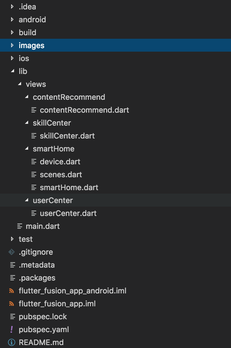
目录结构
把不同tab 对应的视图分别放在各自的页面中,在 main.dart 文件中引入;
main.dart 页面代码:
效果:
构造函数:
BottomNavigationBar({Key key, @required List<BottomNavigationBarItem> items, ValueChanged<int> onTap, int currentIndex: 0, BottomNavigationBarType type, Color fixedColor, double iconSize: 24.0 })属性:
List<BottomNavigationBarItem>一个BottomNavigationBarItemwidget列表;BottomNavigationBarType.fixed和BottomNavigationBarType.shifting两个值,控制底部导航的样式。没有显示的设置此值时,默认值根据底部 tab 的个数自动设置。底部 tab 少于四个(不包括四个)时,默认值为
BottomNavigationBarType.fixed,否则默认值为BottomNavigationBarType.shiftingBottomNavigationBarType.fixed:- BottomNavigationBar的BottomNavigationBarItem具有固定的宽度,始终显示其文本标签,并且在点击时不会移位。
- 底部导航条的背景颜色默认为不透明的白色,如果设置了
ThemeData.canvasColor则与ThemeData.canvasColor颜色值一致。- BottomNavigationBarItem中设置 backgroundColor 失效。
- 选中的BottomNavigationBarItem的颜色为设置的 fixedColor 颜色,如果没有设置fixedColor属性,则与
ThemeData.primaryColor颜色一致。BottomNavigationBarType.shifting:- BottomNavigationBar的BottomNavigationBarItem有位置和大小动画,并在点击时标注淡入淡出。只有选定的项目显示其文本标签。
- 底部导航条的背景颜色默认为白色,可以在BottomNavigationBarItem的backgroundColor属性中设置每个 item 的背景颜色值。底部导航条的背景色与当前选中的 item 的背景色一致,
ThemeData.canvasColor在底部导航条的颜色失效。Color。当type值为BottomNavigationBarType.fixed时,设置选中 item 的颜色。 我测试中没什么效果,不知道为什么。double,图标的大小BottomNavigationBarType.shifting时代码:
效果如图:
BottomNavigationBarItem
构造函数
BottomNavigationBarItem({@required Widget icon, Widget title, Widget activeIcon, Color backgroundColor })The text was updated successfully, but these errors were encountered: