原文地址 翻译:DeveloperLx
Update note: This NSCollectionView tutorial has been updated to Xcode 8 and Swift 3 by Gabriel Miro.
A collection view is a powerful mechanism for laying out an ordered set of data items in a visual way. Finder and Photos both do this: they let you tab through files in a gallery layout.
Introduced in OS X 10.5,
NSCollectionView
offered a handy means of arranging a group of objects in a grid of identically-sized
items displayed in a scrollable view.
OS X 10.11 El Capitan gave
NSCollectionView
a major overhaul inspired by
UICollectionView
from iOS.
macOS 10.12 added two additional features to close the gap with iOS: collapsible sections (like in Finder) and sticky headers.
In this NSCollectionView tutorial, you’ll build SlidesMagic — your own grid-based image browsing app.
This tutorial assumes that you know the basics of writing macOS apps. If you’re new to macOS, you should take a look at the macOS tutorials available here, and then come back to learn about collection views.
The SlidesMagic app you’re going to build is a simple image browser. It’s pretty cool, but don’t get all excited and delete Photos from your Mac just yet. :]
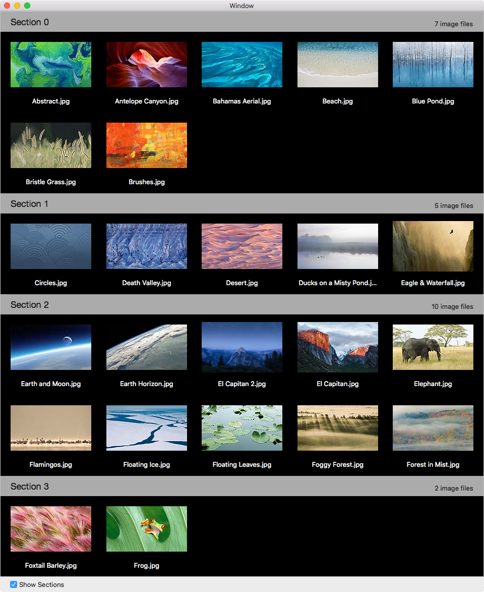
It retrieves all image files from a folder on the file system and displays them with their names in an elegant collection view. The finished app will look like this:
Download the starter project here . Build and run:

At this point, it appears to be an empty window, but it has hidden features that will become the foundation of an image browser.
When SlidesMagic launches, it automatically loads all the images from the system’s Desktop Pictures folder. From Xcode ‘s console log, you can see the file names.

That list in the console is an indicator that the model-loading logic is in place. You can choose another folder by selecting File/Open Another Folder… menu.
The starter project provides functionality that is not directly related to collection views, but is specific to SlidesMagic .

- ImageFile.swift : Encapsulates a single image file
- ImageDirectoryLoader.swift : Helper class that loads image files from the disk
The application has two main controllers:
-
WindowController.swift
–
windowDidLoad(): Sets the initial size of the window on the left half of the screen.openAnotherFolder(\_:)presents a standard open dialog to choose a different folder. -
ViewController.swift
–
viewDidLoad()opens the Desktop Pictures folder as the initial folder to browse.
NSCollectionView
is the main view; it displays visual items and is assisted by several
key components.
NSCollectionViewLayout
: Specifies the layout of the collection view. It’s an abstract class
from which all concrete layout classes inherit.
NSCollectionViewFlowLayout
: Provides a flexible grid-like layout. For most apps, this layout can
be used to achieve your desired results.
NSCollectionViewGridLayout
: A pre-OS X 10.11 compatibility class, and not recommended for new apps.

Sections and
IndexPath
: Allows for grouping of items into sections. The items form an ordered
list of sections, each containing an ordered list of items. Each item is
associated with an index that comprises of a pair of integers (section,
item) encapsulated in an
IndexPath
instance. When grouping of items into sections isn’t required, you still
have at least one section (by default).

Like many other Cocoa frameworks, items in the collection view follow the MVC design pattern.
The Model and the View : The items’ content comes from your model’s data objects. Each individual object that becomes visible gets its own view in the larger collection view. The structure of these individual views are defined in a separate nib with file extension .xib.
The Controller
: The nib mentioned above is owned by an instance of
NSCollectionViewItem
, which is a descendant of
NSViewController
. It mediates the flow of information between the items’ views and model
objects. Generally, you subclass
NSCollectionViewItem
. When items are not of the same kind, you define a different subclass
and nib for each variant.
To display extra information in the collection view that’s not part of an individual item, you’d use supplementary views. Some common implementations of these are section headers and footers.
-
NSCollectionViewDataSource: Populates the collection view with items and supplementary views. -
NSCollectionViewDelegate: Handles events related to drag-and-drop, selection and highlighting. -
NSCollectionViewDelegateFlowLayout: Lets you customize a flow layout.
Open Main.storyboard . Go to the Object Library , and drag a Collection View into the view of the View Controller Scene .

Resize the Bordered Scroll View so it takes up the entire area of the parent view. Then, select Editor/Resolve Auto Layout Issues/Add Missing Constraints to add the Auto Layout constraints.
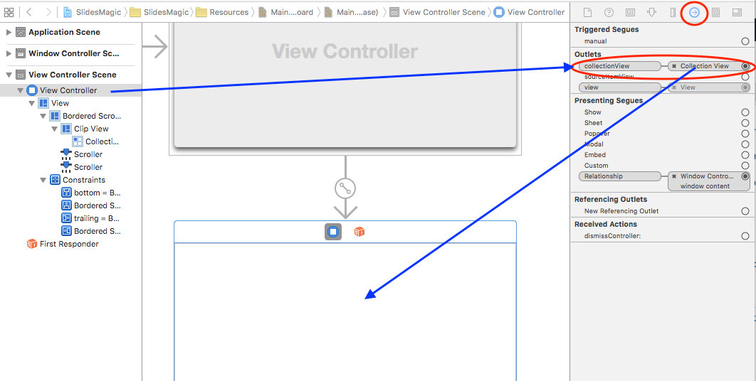
You need to add an outlet in
ViewController
to access the collection view. Open
ViewController.swift
and add the following inside the
ViewController
class definition:
@IBOutlet weak var collectionView: NSCollectionView!
|
Open Main.storyboard , and select the View Controller inside the View Controller Scene .
Open the Connections Inspector and find the collectionView element within the Outlets section. Connect it to the collection view by dragging from the button next to it to the collection view control in the canvas.
You’ve got options here: you can set the initial layout and some of its attributes in Interface Builder , or you can set them programmatically.
For SlidesMagic, you’ll take the programmatic approach.
Open
ViewController.swift
and add the following method to
ViewController
:
                            fileprivate func configureCollectionView() { // 1 let flowLayout = NSCollectionViewFlowLayout()
                            flowLayout.itemSize = NSSize(width: 160.0, height: 140.0) flowLayout.sectionInset
                            = EdgeInsets(top: 10.0, left: 20.0, bottom: 10.0, right: 20.0) flowLayout.minimumInteritemSpacing
                            = 20.0 flowLayout.minimumLineSpacing = 20.0 collectionView.collectionViewLayout
                            = flowLayout // 2 view.wantsLayer = true // 3 collectionView.layer?.backgroundColor
                            = NSColor.black.cgColor }
|
Here’s what you’re doing in this method:
-
Creating an
NSCollectionViewFlowLayoutand setting its attributes and thecollectionViewLayoutproperty of theNSCollectionView. -
For optimal performance,
NSCollectionViewis designed to be layer-backed. So, you’re setting an ancestor’swantsLayerproperty totrue. - Setting the collection view’s background color to black.
You need to call this method when the view is created, so add this to
the end of
viewDidLoad()
:
configureCollectionView()
|
Build and run:

At this point, you have a black background and a layout.
Now you need to create an
NSCollectionViewItem
subclass to display your data elements.
Go to File/New/File… , select macOS/Source/Cocoa Class and click Next .
Set the
Class
field to
CollectionViewItem
, the
Subclass of
field to
NSCollectionViewItem
, and check
Also create XIB for user interface
.
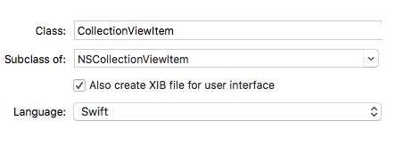
Click Next , and in the save dialog, select Controllers from Group and click Create .
Open CollectionViewItem.swift and replace the entire class with this:
                            import Cocoa class CollectionViewItem: NSCollectionViewItem {   //
                            1 var imageFile: ImageFile? { didSet { guard isViewLoaded else { return
                            } if let imageFile = imageFile { imageView?.image = imageFile.thumbnail
                            textField?.stringValue = imageFile.fileName } else { imageView?.image =
                            nil textField?.stringValue = "" } } }   // 2 override func viewDidLoad()
                            { super.viewDidLoad() view.wantsLayer = true view.layer?.backgroundColor
                            = NSColor.lightGray.cgColor } }
|
In here, you do the following:
-
Define the
imageFileproperty that holds the model object to be presented in this item. When set, itsdidSetproperty observer sets the content of the item’s image and label. - Change the background color of the item’s view.
When you created CollectionViewItem.swift you selected “Also create a XIB” which produced the CollectionViewItem.xib nib file. For sake of order, drag the nib to the Resources group just below Main.storyboard .
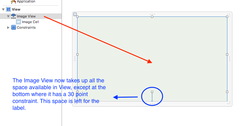
The View in the nib is the root view for a subtree of controls to be displayed in each item. You’re going to add an image view for the slide and a label for the file name.
Open CollectionViewItem.xib .
Add an
NSImageView
:
- From the Object Library , add an Image View to View .
- Click Pin from the Auto Layout toolbar to set its constraints.
- Set the top , leading and trailing constraints to 0, the bottom to 30. Choose Update Frames: Items of New Constraints and click Add 4 Constraints .

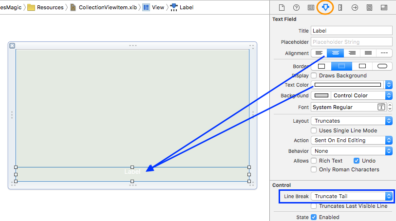
Add a label:
- From the Object Library , add a Label below the Image View .
- Click the Pin button. Set the top , bottom , trailing and leading constraints to 0. Choose Update Frames: Items of New Constraints and click Add 4 Constraints .


Select the Label , and in the Attributes Inspector set the following attributes:
- Alignment to center
- Text Color to white
- Line Break to Truncate Tail
Though the
File’s Owner
in the nib is of the type
CollectionViewItem
, it is simply a placeholder. When the nib is instantiated, it must contain
a “real” single top-level instance of
NSCollectionViewItem
.
Drag a
Collection View Item
from the
Object Library
and drop it into
Document Outline
. Select it, and in the
Identity Inspector
, set its
Class
to
CollectionViewItem
.

In the CollectionViewItem.xib , you need to connect the view hierarchy to the outlets of CollectionViewItem . In the xib:
- Select Collection View Item and show the Connections Inspector .
-
Drag from the
viewoutlet to the View in the Document Outline -
In the same way, connect the
imageViewandtextFieldoutlets to Image View and Label in the Document Outline

You need to implement the data source protocol so the view knows the answers to these questions:
- How many sections are in the collection?
- How many items are in each section?
- Which item is associated with a specified index path?
Open ViewController.swift and add the following extension at the end of the file:
                            extension ViewController : NSCollectionViewDataSource {   // 1 func
                            numberOfSections(in collectionView: NSCollectionView) -> Int { return
                            imageDirectoryLoader.numberOfSections }   // 2 func collectionView(_
                            collectionView: NSCollectionView, numberOfItemsInSection section: Int)
                            -> Int { return imageDirectoryLoader.numberOfItemsInSection(section)
                            }   // 3 func collectionView(_ itemForRepresentedObjectAtcollectionView:
                            NSCollectionView, itemForRepresentedObjectAt indexPath: IndexPath) ->
                            NSCollectionViewItem {   // 4 let item = collectionView.makeItem(withIdentifier:
                            "CollectionViewItem", for: indexPath) guard let collectionViewItem = item
                            as? CollectionViewItem else {return item}   // 5 let imageFile = imageDirectoryLoader.imageFileForIndexPath(indexPath)
                            collectionViewItem.imageFile = imageFile return item }   }
|
- When your app doesn’t support sections, you can omit this method because a single section will be assumed.
-
This is one of two required methods for
NSCollectionViewDataSource. Here you return the number of items in the specified section. -
This is the second required method. It returns a collection view item
for a given
indexPath. -
This method instantiates an item from a nib where its name equals the
value of the
identifierparameter. It attempts to reuse an unused item of the requested type, and if nothing is available it creates a new one. -
Gets the model object for the given
IndexPathand sets the content of the image and the label.
Your next step is to define the data source.
Open Main.storyboard and select the collection view.
Open the Connections Inspector and locate dataSource in the Outlets section. Drag from the adjacent button to the View Controller in Document Outline View .

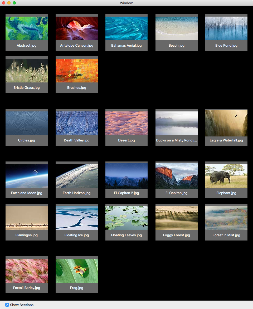
Build and run, and your collection view should display images from the Desktop Pictures folder:

Voilà! It was worth all that work!
If you don’t see images, then you probably just missed something small.
- Are all the connections in the Connections Inspector set as instructed?
-
Did you set the
dataSourceoutlet? - Did you use the right type for custom classes in the Identity Inspector .
-
Did you add the top level
NSCollectionViewItemobject and change its type toCollectionViewItem? -
Is the value for the
identifierparameter inmakeItemWithIdentifieridentical to the nib name?
To display images from a folder other than the system’s Desktop Pictures folder, select File/Open Another Folder… and choose a folder that has image formats such as jpg or png .
But nothing seems to change in the window — it still displays the images from the Desktop Pictures folder. Although when you look at the console log, you can see the file names are from the new folder.
To refresh the collection view’s visible items, you need to call its
reloadData()
method.
Open
ViewController.swift
and add this code to the end of
loadDataForNewFolderWithUrl(\_:)
:
collectionView.reloadData()
|
Build and run. You’ll now have the correct images displayed in the window.
SlidesMagic is doing some serious magic now. But you’re going to improve it by adding sections.
First, you need to add a check box to the bottom of the view so you can toggle between single and multi-section.
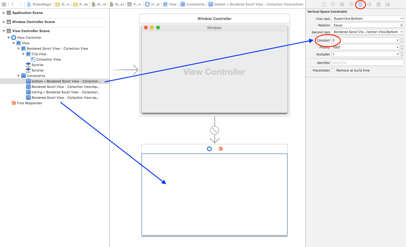
Open Main.storyboard , and in the Document Outline view, select the scroll view’s bottom constraint. Open the Size Inspector and change its Constant to 30.
This moves the collection view up to make room for the check box.

Now, drag a Check Box Button from the Object Library into the space below the collection view. Select it, and in the Attributes Inspector , set its Title to Show Sections , and its State to Off .

Then, set its Auto Layout constraints by selecting the pin button and set the top constraint to 8 and the leading constraint to 20. Choose Update Frames: Items of New Constraints and click Add 2 Constraints .
Build and run. It should look like this at the bottom:

When you click the box, the application needs to change the collection view’s appearance.
Open
ViewController.swift
and add the following method at the end of the
ViewController
class:
                            @IBAction func showHideSections(sender: NSButton) { let show = sender.state
                            // 1 imageDirectoryLoader.singleSectionMode = (show == NSOffState) // 2
                            imageDirectoryLoader.setupDataForUrls(nil) // 3 collectionView.reloadData()
                            }
|
Here’s what you’re doing:
- Setting single or multi-section mode according to the state of the box.
-
You rearrange the model according to the selected mode. The
nilvalue passed means you skip image loading — same images, different layout. - Model changed, discard visible items and redisplay them.
If you’re curious how images are distributed across sections, look up
sectionLengthArray
in
ImageDirectoryLoader
. The number of elements in this array sets the max number of sections,
and the element values set the number of items in each section.
Now, open Main.storyboard . In the Document Outline , Control-drag from the Show Sections control over the View Controller . In the black pop-up window click showHideSections: to connect it. You can check if the connection was set properly in the Connections Inspector .

Build and run; check Show Sections and watch the layout change.

To get better visual separation between sections, open
ViewController.swift
and modify the layout’s
sectionInset
property in the
configureCollectionView()
method.
Replace:
                            flowLayout.sectionInset = EdgeInsets(top: 10.0, left: 20.0, bottom: 10.0,
                            right: 20.0)
|
With this:
                            flowLayout.sectionInset = EdgeInsets(top: 30.0, left: 20.0, bottom: 30.0,
                            right: 20.0)
|
Build and run; check Show Sections , and note the additional spacing between sections.
Another way to see section boundaries is to add a header or footer view.
To do this, you need a custom
NSView
class and will need to implement a data source method to provide the header
views to the collection view.
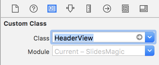
To create the header view, select File/New/File… . Select macOS/User Interface/View and click Next .
Enter HeaderView.xib as the file name and for Group select Resources .
Click Create .

Open HeaderView.xib and select the Custom View . Open the Size Inspector and change Width to 500 and Height to 40.
Drag a label from the Object Library to the left-hand side of Custom View . Open the Attributes Inspector and change Title to Section Number and Font Size to 16 .
Drag a second label to the right-hand side of Custom View and change Title to Images Count and Alignment to Right .
Set the Section Number labels Auto Layout constraints by selecting the pin button and set the top constraint to 12 and the leading constraint to 20. Choose Update Frames: Items of New Constraints and click Add 2 Constraints .
Next, set the Images Count labels top constraint to 11 and the trailing constraint to 20. Be sure to choose Update Frames: Items of New Constraints and click Add 2 Constraints .
The header view should look like this:

With the interface ready for show time, the next task is to create a custom view subclass for the header view.
Select File/New/File… to create a new file.
Choose
macOS/Source/Cocoa Class
, name the class
HeaderView
, and then make it a subclass of
NSView
. Click Next, and for
Group
select
Views
. Click
Create
.
Open HeaderView.swift and replace the contents of the class with the following:
                            // 1 @IBOutlet weak var sectionTitle: NSTextField! @IBOutlet weak var
                            imageCount: NSTextField!   // 2 override func draw(_ dirtyRect: NSRect)
                            { super.draw(dirtyRect) NSColor(calibratedWhite: 0.8 , alpha: 0.8).set()
                            NSRectFillUsingOperation(dirtyRect, NSCompositingOperation.sourceOver)
                            }
|
In here, you’re:
- Setting up outlets you’ll use to connect to the labels in the nib.
- Drawing a gray background.
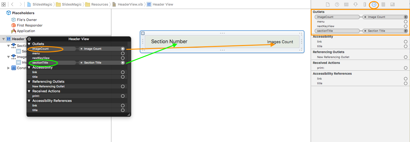
To connect the outlets to the labels, open HeaderView.xib and select the Custom View . Open the Identity Inspector and change the Class to HeaderView .
In the Document Outline view, Control-click on the Header View . In the black pop-up window, drag from imageCount to the Images Count label on the canvas to connect the outlet.
Repeat the operation for the second label, dragging from sectionTitle to the Section Number label in the canvas.
Your header view is in place and ready to go, and you need to pass the
header views to the collection view to implement
collectionView(\_:viewForSupplementaryElementOfKind:at:)
.
Open
ViewController.swift
and add the following method to the
NSCollectionViewDataSource
extension:
                            func collectionView(_ collectionView: NSCollectionView, viewForSupplementaryElementOfKind
                            kind: String, at indexPath: IndexPath) -> NSView { // 1 let view = collectionView.makeSupplementaryView(ofKind:
                            NSCollectionElementKindSectionHeader, withIdentifier: "HeaderView", for:
                            indexPath) as! HeaderView // 2 view.sectionTitle.stringValue = "Section
                            \(indexPath.section)" let numberOfItemsInSection = imageDirectoryLoader.numberOfItemsInSection(indexPath.section)
                            view.imageCount.stringValue = "\(numberOfItemsInSection) image files" return
                            view }
|
The collection view calls this method when it needs the data source to provide a header for a section. The method does the following:
-
Calls
makeSupplementaryViewOfKind(\_:withIdentifier:for:)to instantiate aHeaderViewobject using the nib with a name equal towithIdentifier. - Sets the values for the labels.
At the end of
ViewController.swift
, add this
NSCollectionViewDelegateFlowLayout
extension:
                            extension ViewController : NSCollectionViewDelegateFlowLayout { func collectionView(_
                            collectionView: NSCollectionView, layout collectionViewLayout: NSCollectionViewLayout,
                            referenceSizeForHeaderInSection section: Int) -> NSSize { return imageDirectoryLoader.singleSectionMode
                            ? NSZeroSize : NSSize(width: 1000, height: 40) } }
|
The above method, although technically optional, is a must when you use headers because the flow layout delegate needs to provide the size of the header for every section.
When not implemented, the header won’t show because zero size is assumed. Additionally, it ignores the specified width, effectively setting it to the collection view’s width.
In this case, the method returns a size of zero when the collection view is in single section mode, and it returns 40 when in multiple sections mode.
For the collection view to use
NSCollectionViewDelegateFlowLayout
, you must connect
ViewController
to the
delegate
outlet of
NSCollectionView
.
Open Main.storyboard and select the collection view. Open the Connections Inspector , and locate the delegate in the Outlets section. Drag from the button next to it to the view controller in the Document Outline .

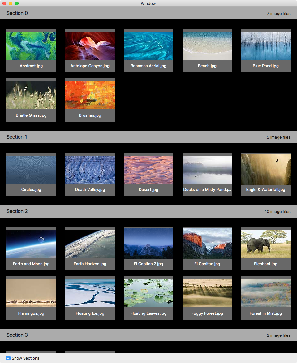
Build and run; check Show Sections and watch your header neatly define sections:
New to macOS 10.12 are the
NSCollectionViewFlowLayout
properties
sectionHeadersPinToVisibleBounds
and
sectionFootersPinToVisibleBounds
.
When
sectionHeadersPinToVisibleBounds
is set to
true
, the header view for the topmost visible section will stay pinned to
the top of the scroll area instead of being scrolled out of view. As you
scroll down, the header stays pinned to the top until the next section’s
header pushes it out of the way. This behavior is referred to as “sticky
headers” or “floating headers”.
Setting
sectionFootersPinToVisibleBounds
to
true
behaves similarly, pinning footers to the bottom of the scroll area.
Open
ViewController.swift
and at the end of
configureCollectionView()
add the line:
flowLayout.sectionHeadersPinToVisibleBounds = true
|
Build and run. Check Show Sections and scroll up a bit so the first row partially scrolls out of view.
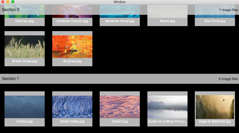
Watch how the first section header is still visible and the first row shows through the section header.
NSCollectionViewFlowLayout
and overriding the
layoutAttributesForElements(in:)
method. This is described in detail in our
Advanced Collection Views in OS X Tutorial
.
To show an item as selected, you’ll set a white border, non-selected items will have no border.
First, you need to make the collection view selectable. Open the Main.storyboard , select the Collection View and in the Attributes Inspector , check Selectable .

Checking Selectable enables single selection, meaning you can click an item to select it. When you choose a different item, it deselects the previous item and selects the item you just picked.
When you select an item:
-
Its
IndexPathis added to theselectionIndexPathsproperty ofNSCollectionView. -
The
isSelectedproperty of the associatedNSCollectionViewItemis set totrue.
Open
CollectionViewItem.swift
. Add the following at the end of
viewDidLoad()
:
                            // 1 view.layer?.borderColor = NSColor.white.cgColor // 2 view.layer?.borderWidth
                            = 0.0
|
- Sets white for the border when its width is greater than zero
-
Sets
borderWidthto0.0to guarantee that a new item has no border — i.e, not selected
To set the
borderWidth
each time the
isSelected
property changes add the following code at the top of the
CollectionViewItem
class:
                            override var isSelected: Bool { didSet { view.layer?.borderWidth = isSelected
                            ? 5.0 : 0.0 } }
|
Whenever
isSelected
is changed,
didSet
will add or remove the white border according the new value of the property.
isSelected
property is not always the right way to test whether an item is selected
or not. When an item is outside the collection view’s
visibleRect
the collection view isn’t maintaining an
NSCollectionViewItem
instance for this item. If this is the case than the collection view’s
item(at:)
method will return
nil
. A general way to check whether an item is selected or not is to check
whether the collection view’s
selectionIndexPaths
property contains the index path in question.
Build and run.

Click an item and you’ll see highlighting. Choose a different image and you’ll see fully functional highlighting. Poof! Magic!

Download the final version of SlidesMagic here .
In this NSCollectionView tutorial, you went all the way from creating your first ever collection view, through discovering the intricacies of the data source API with sections, to handling selection. Although you covered a lot of ground, you’ve only started to explore the capabilities of collection views. Here are more great things to check out:
- “Data Source-less” collection views using Cocoa Bindings
- Different kind of items
- Adding and removing items
- Custom layouts
- Drag and drop
- Animations
-
Tweaking
NSCollectionViewFlowLayout - Collapsible Sections (new in macOS 10.12)
Some of these topics are covered in our Advanced Collection Views in OS X Tutorial .
The video, documents, and code in the list below are recommended to get an even better understanding of collection views:
- WWDC 2015 – Session 225 – What’s New in NSCollectionView
- AppKit Release Notes (OS X v10.11)
- AppKit Release Notes for macOS 10.12
- CocoaSlideCollection – Sample code of WWDC Session 225 above. Written in Objective-C
-
Exhibition
– Sample code from Apple, written in Swift using
NSCollectionViewGridLayout